NFT Art Platform case Renaissance.digital
UI design UX Figma
Full case on Behance
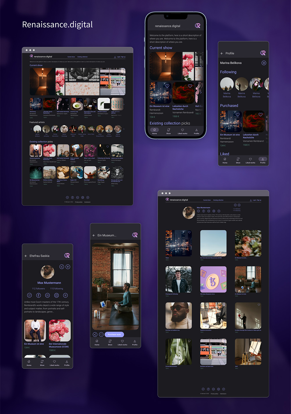
Renaissance.digital is a curated NFT Art platform. It is planned as a website and later an app, aimed at digital artists and digital art collectors. The platform will be running live shows, and the users also have access to the digital NFT market.
Client’s brief
In the first iteration the user should be able to:
- Make an account (add info)
- See the current show information
- See the existing collection of works
- See artist profiles (like, follow)
- See individual artwork info
- Share works / artist profiles on social media
Plans for future development:
- Conect crypto wallet –> purchase /auction functionality
- Minting functionality
- Recently sold artworks highlight
- Past shows archive
- Upcoming shows information
Competitor analysys (brief summary)
On the firsr stage of the work a competitor research was performed and similar platforms, each featuring some of the desired functionality were analysed both visually and structure-wise (what is the target audience, focus of the platform, unique features etc)
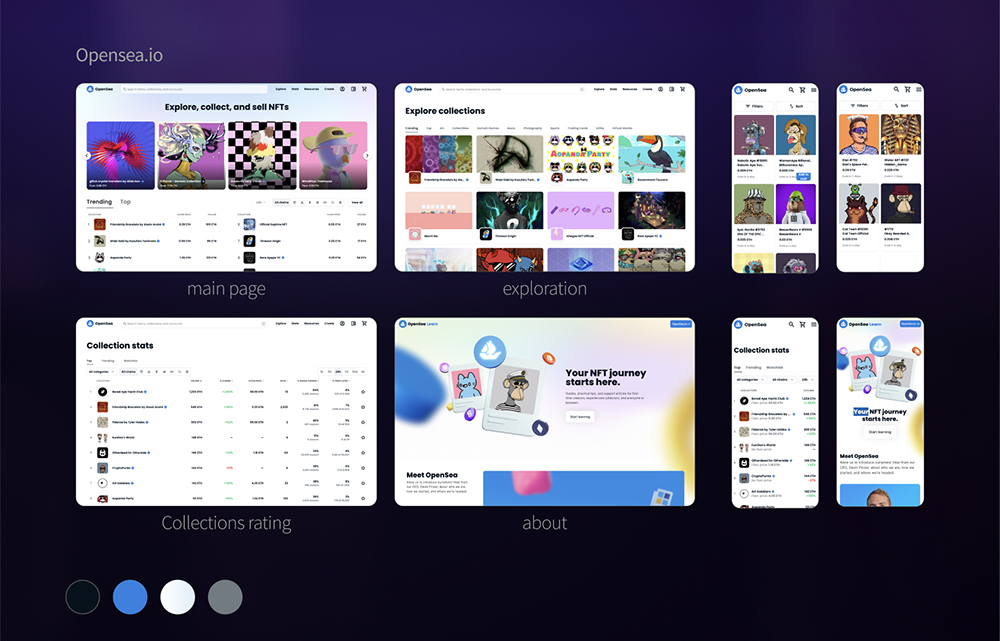
- Design: dark & light theme
- Main function: explore artists, buy & sell works
- Way to explore: through various collections, picks, ratings
- Highlights: “hot collection” on the main page
- Notes: “verified” users, wide selection of blockchains
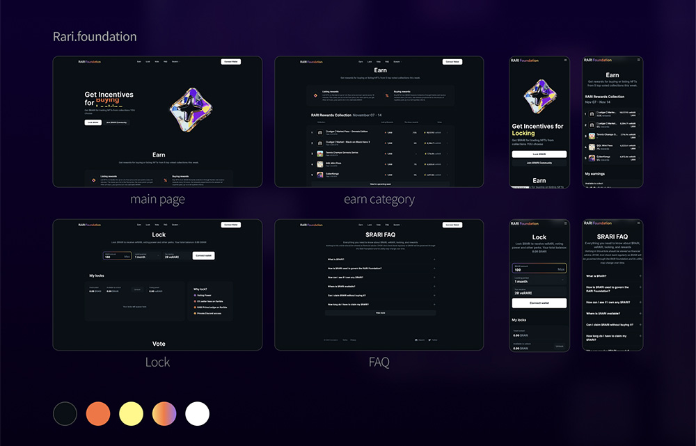
- Design: dark & light theme
- Main function: marketplace, buy & sell, follow
- Way to explore: most of the website is one-pager, voting options leading to works
- Highlights: “RARI Rewards Collection” on the main page
- Notes: a lot of attention to rating, voting, earnings
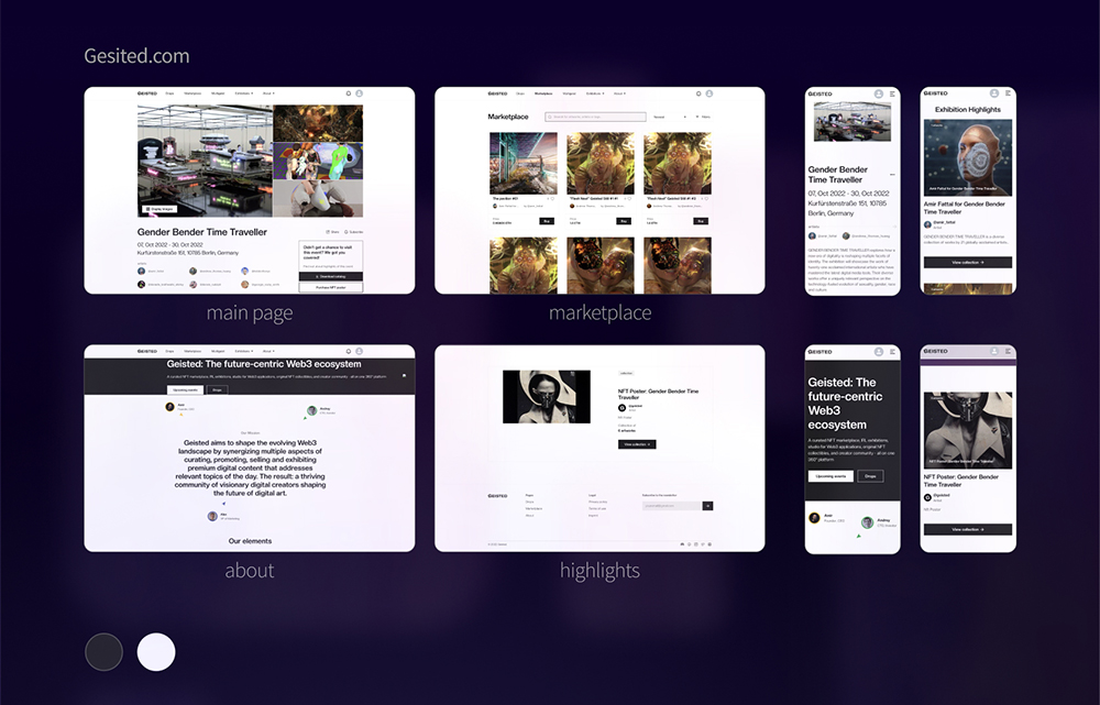
- Design: light theme
- Main function: marketplace, promote live shows and works from them
- Way to explore: exhibition info, individual artists, their collections & highlighted works
- Highlights: some of the works from current exhibitions
- Notes: linked to the “Multigeist” project, has an extensive “about” section
- Design: light theme
- Main function: marketplace
- Way to explore: variety of filters, ratings, categories etc
- Highlights: ratings, “trending”, “top”
- Notes: detailed explanation of NFT, platform etc
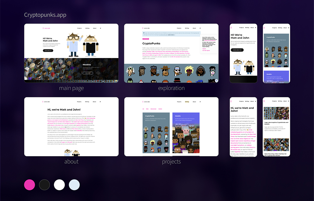
- Design: light theme
- Main function: a project for generating/buying characters
- Way to explore: projects, search for “type of punks”
- Highlights: emphasis on the story of the project
- Notes: detailed explanation of what the platform is and how it works
Developing the structure
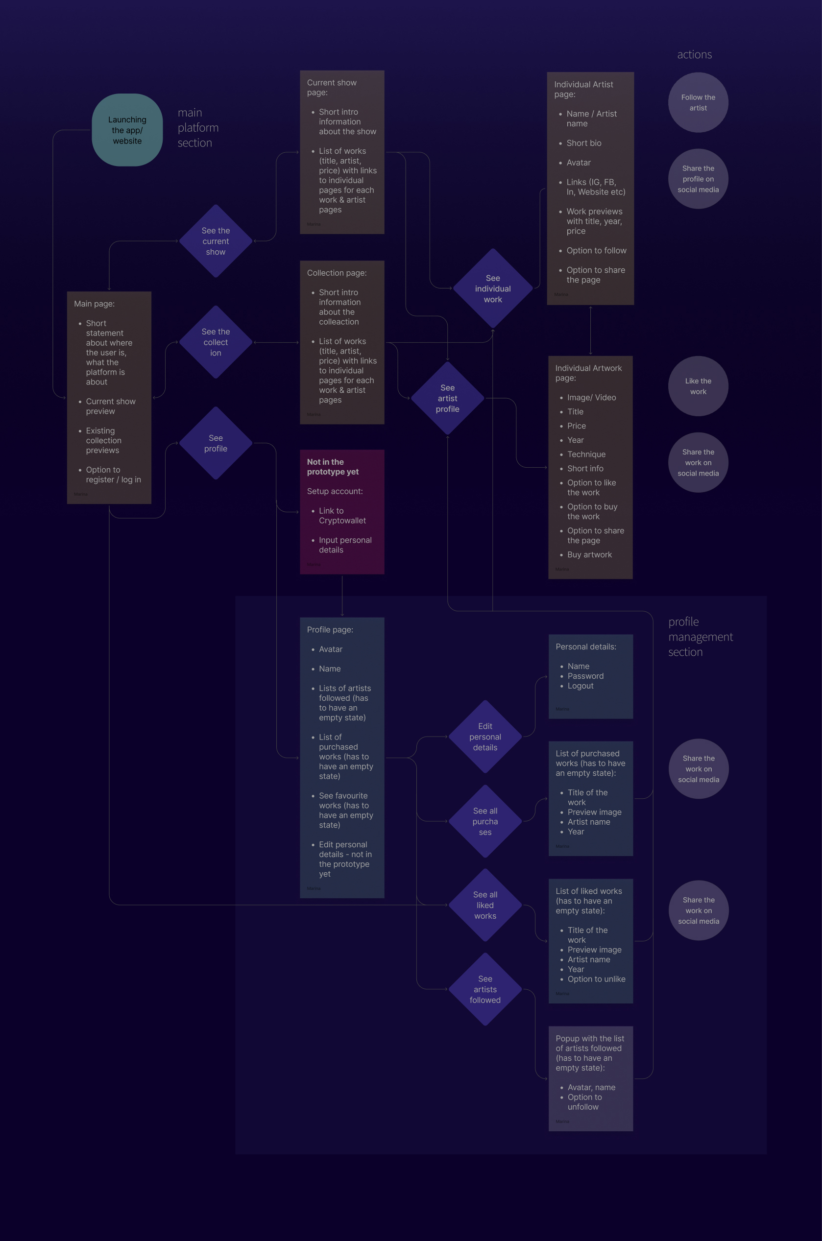
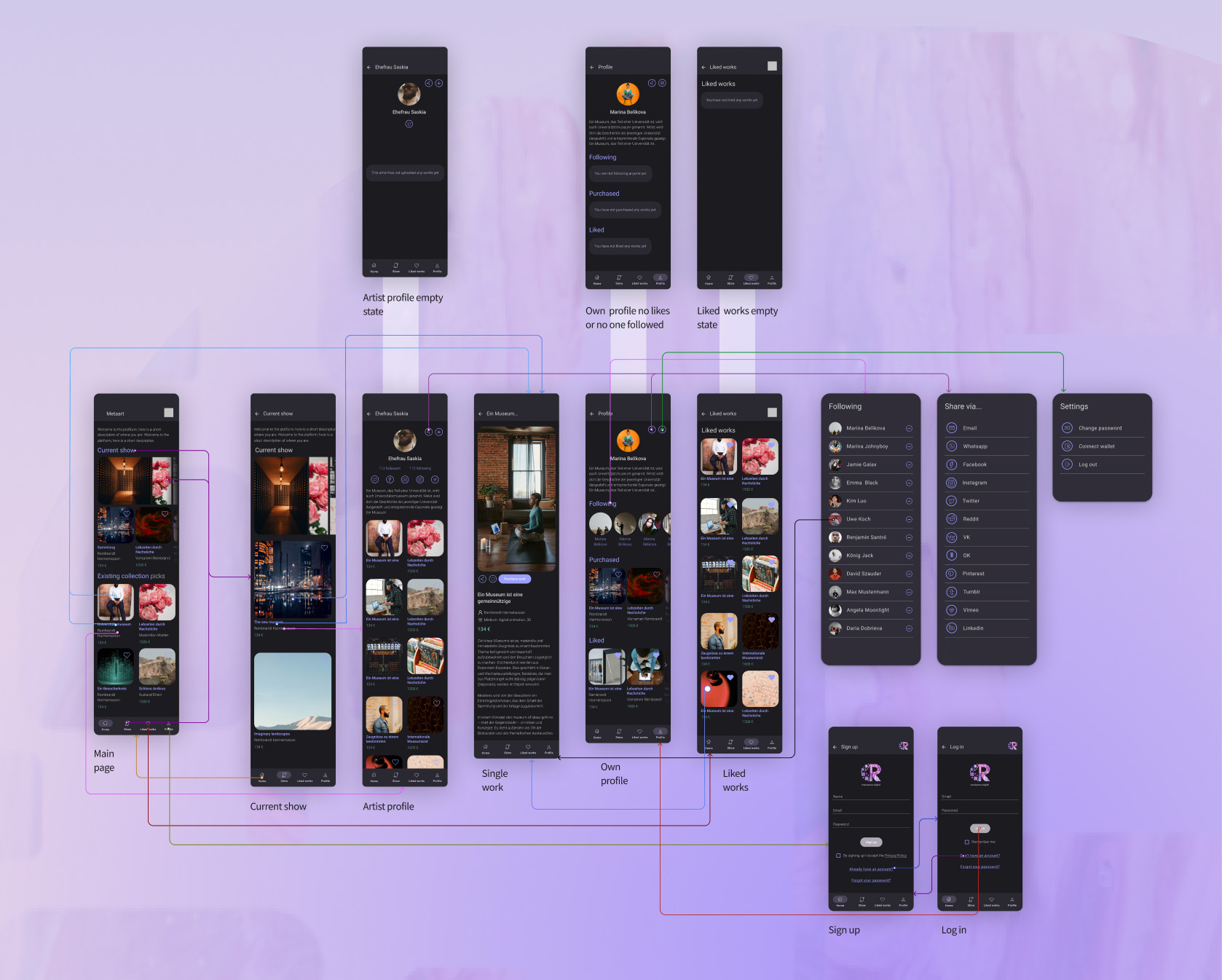
Having analysed similar platforms and based on the client’s platfom’s main focus and goals, the following structure was developed, featuring the basic features for the MVP + the future expansion.
Wireframes
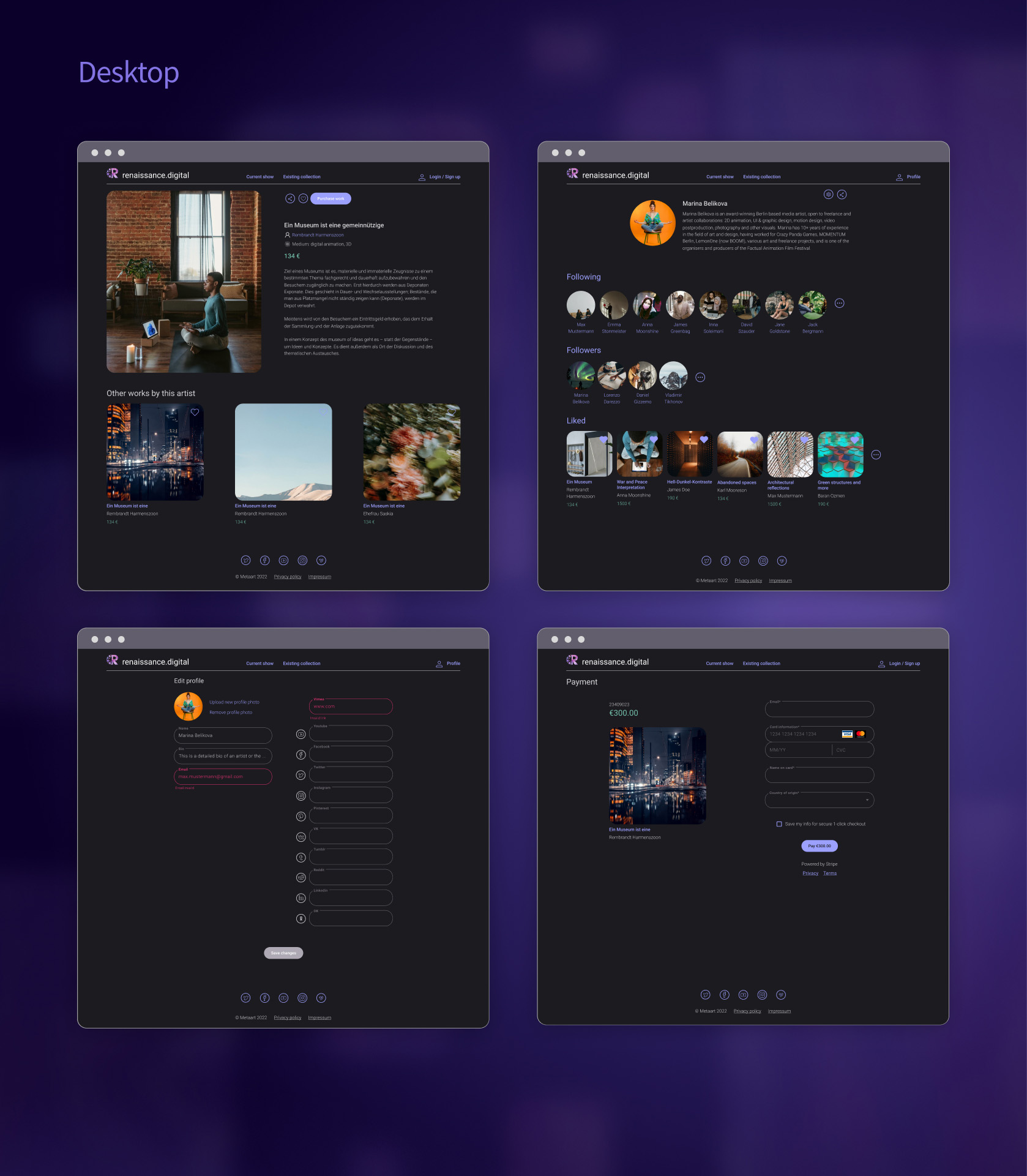
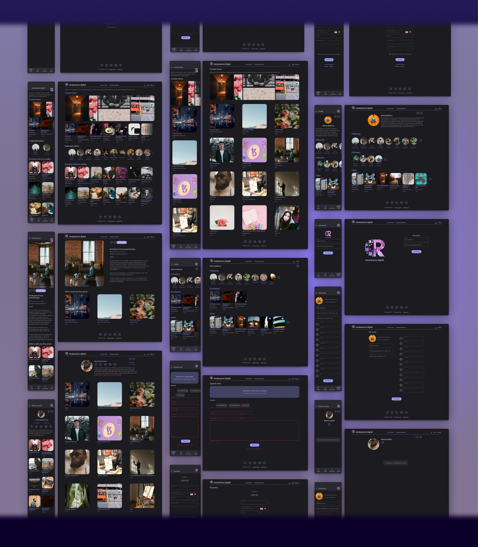
Once the structure was defined, first lofi and then hifi mockups for the key pages were prepared in order to discuss the layout and visual style with the client.
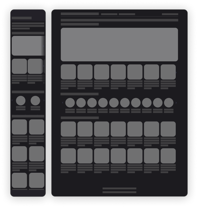
Front page:
- Current show title (link to the show) + banner with selected artworks from this show (same link)
- Selected works from the show (title, artist, price, the list is scrollable)
- Featured artists (scrollable)
- Existing collection picks (curated selection, managed by the platform)
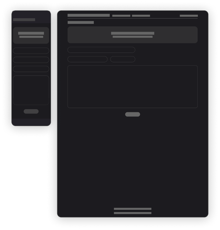
Artwork upload:
- Uploading area (drag & drop component) + file browsing option
- Title, medium, price in EUR, artwork description fields (all of them mandatory)
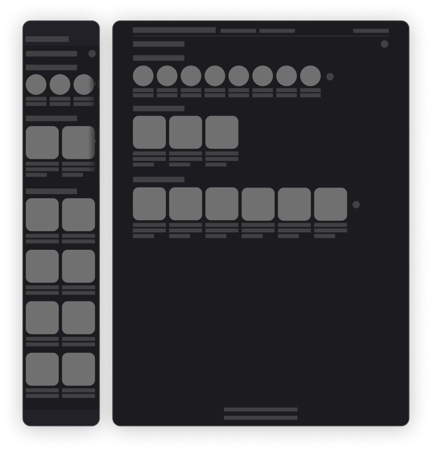
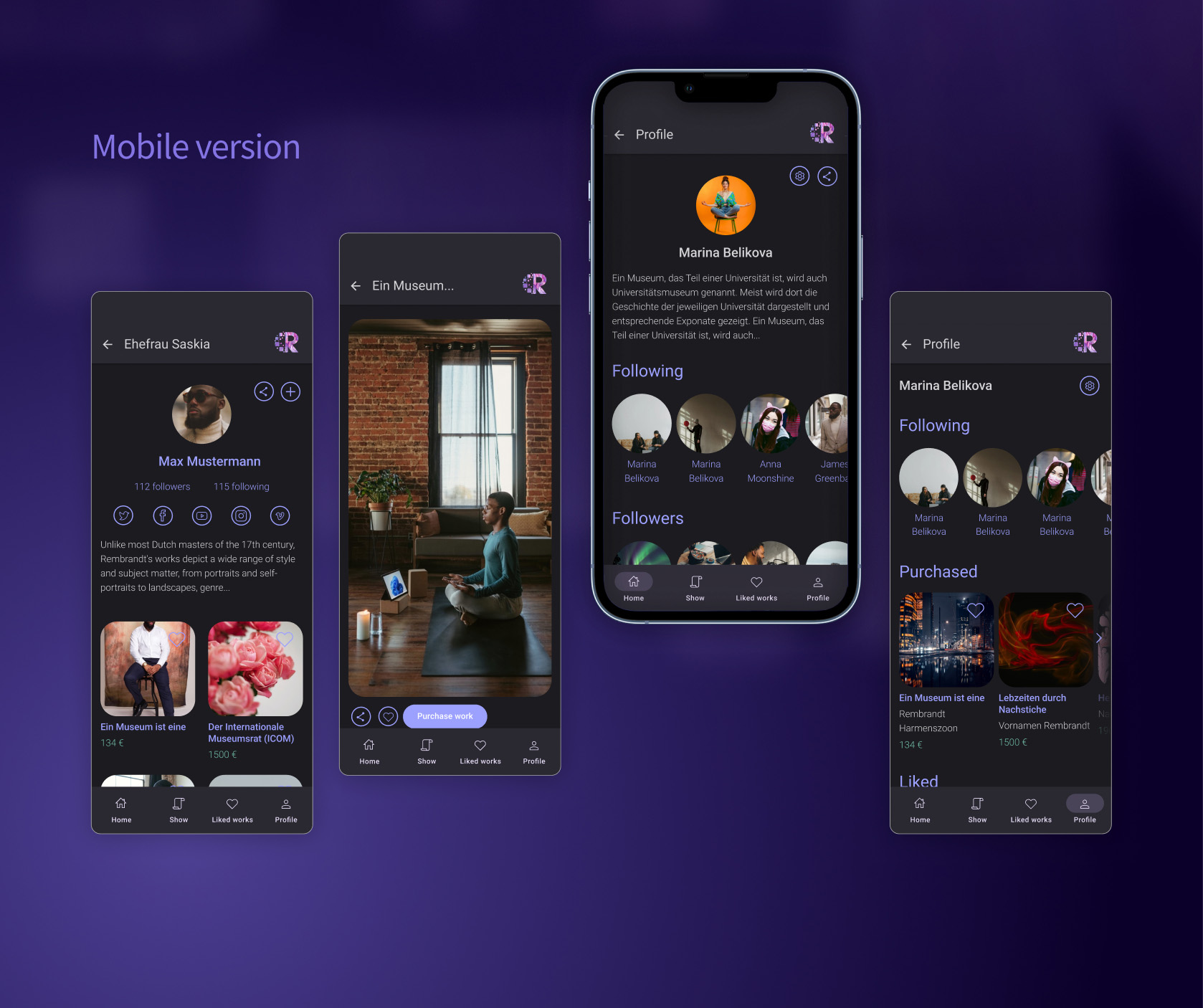
User’s own profile page view:
- Name
- Links to settings, sharing option
- Avatar, bio
- List of followed artists (can be seen full in popup)
- List of followers (can be seen full in popup)
- Liked artworks (can be seen full in popup)
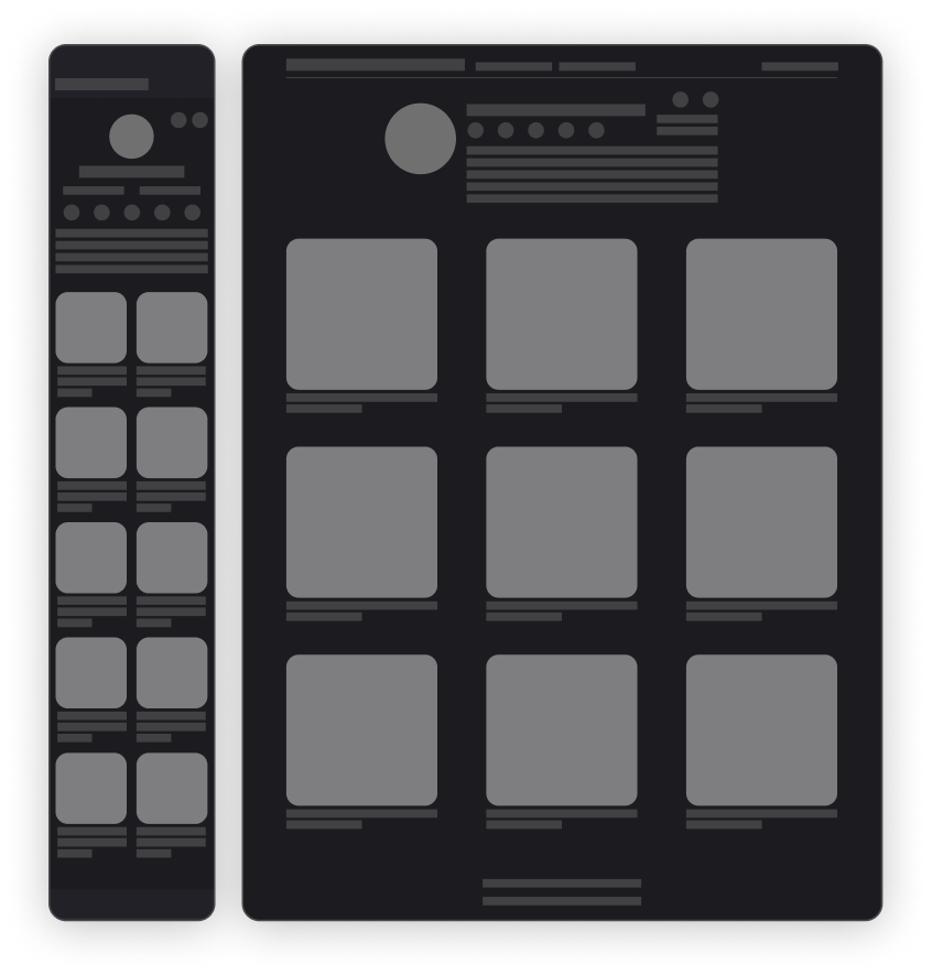
Artist profile page:
- Uploading area (drag & drop component) + file browsing option
- Title, medium, price in EUR, artwork description fields (all of them mandatory)
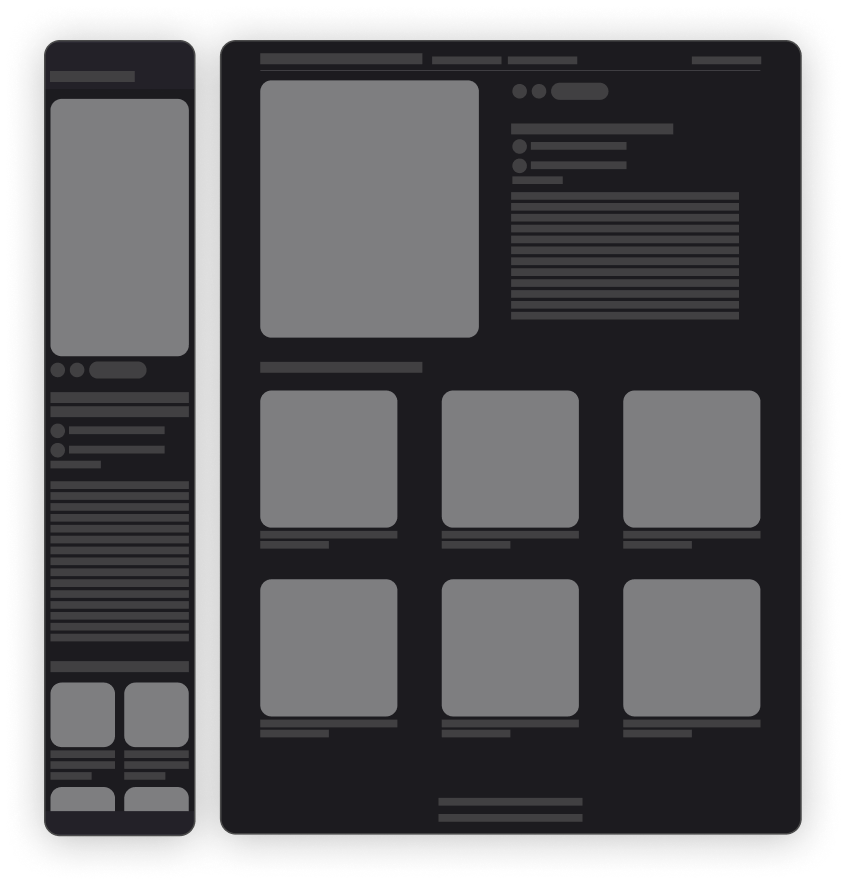
Single artwork page:
- Artwork thumbnail
- Links to share and like
- Title, artist, medium, price, description
- Purchase button
- Related works by the same artist with the title and price
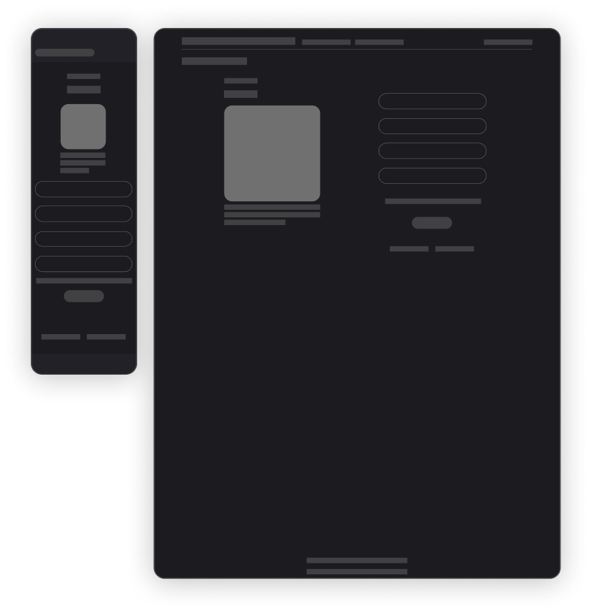
Payment detail page (powered by Stripe):
- Order number
- Artwork title, price & thumbnail
- Payment details (name, card number, country of origin, expiry date, CVC)
- Save info for future payment option
- Privacy policy and terms&conditions links
UI Kit
The design is based on the Material Design 3, using the standard components and a 4 pixel module. According to the customer’s requirements the website only has a dark theme.
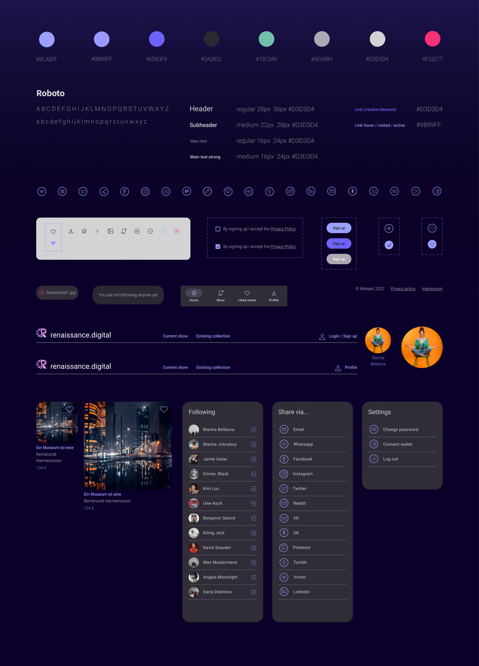
Various states
The design is based on the Material Design 3, using the standard components and a 4 pixel module. According to the customer’s requirements the website only has a dark theme.
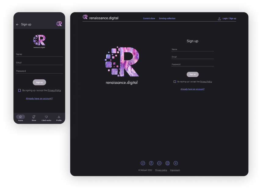
signup page

reset password: email not registered
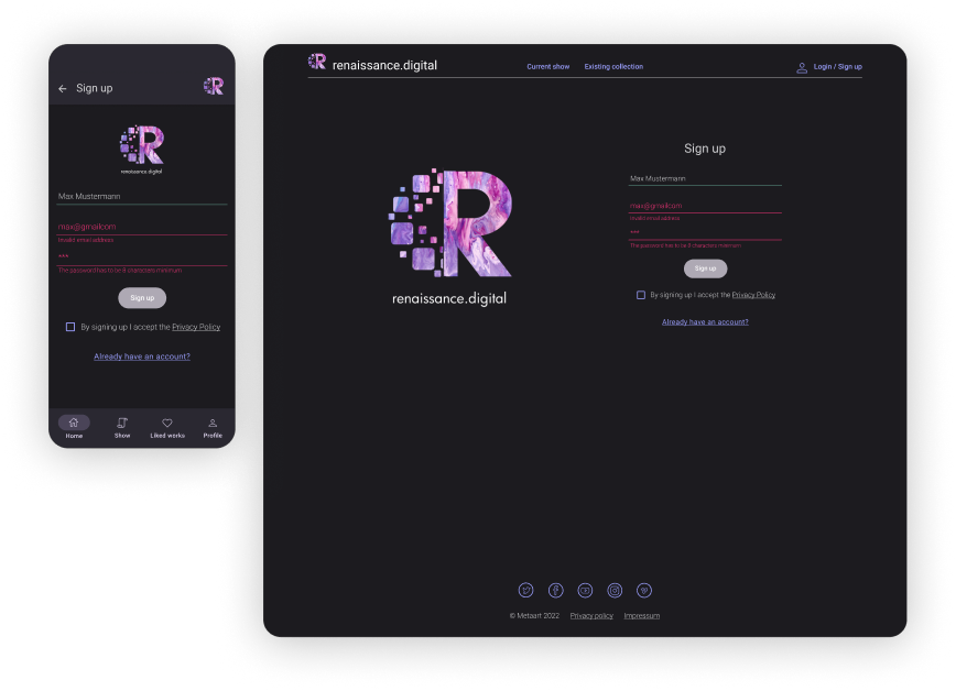
signup: invalid email & passowrd
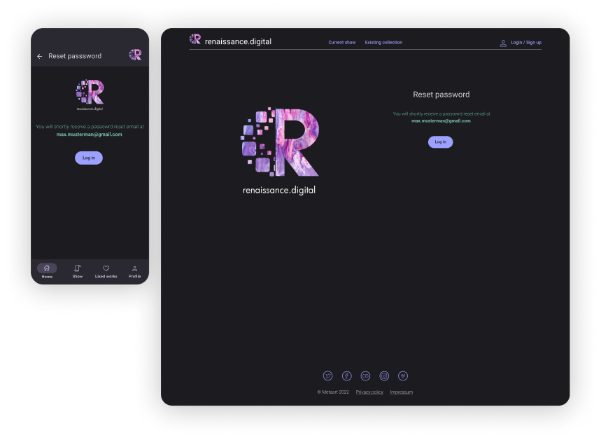
password reset successful

work upload
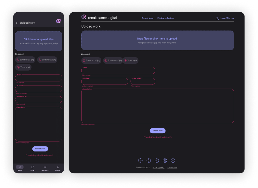
work upload: mandatory fields empty

work upload in process
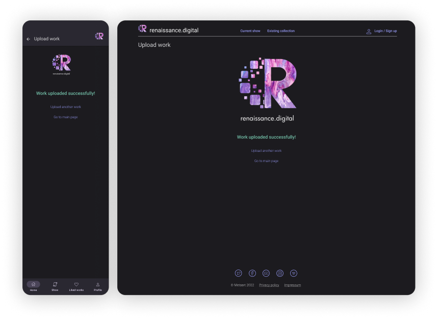
work upload successful
Bringing everything together
The design is based on the Material Design 3, using the standard components and a 4 pixel module.
Userflow with the existing screens
Final look
