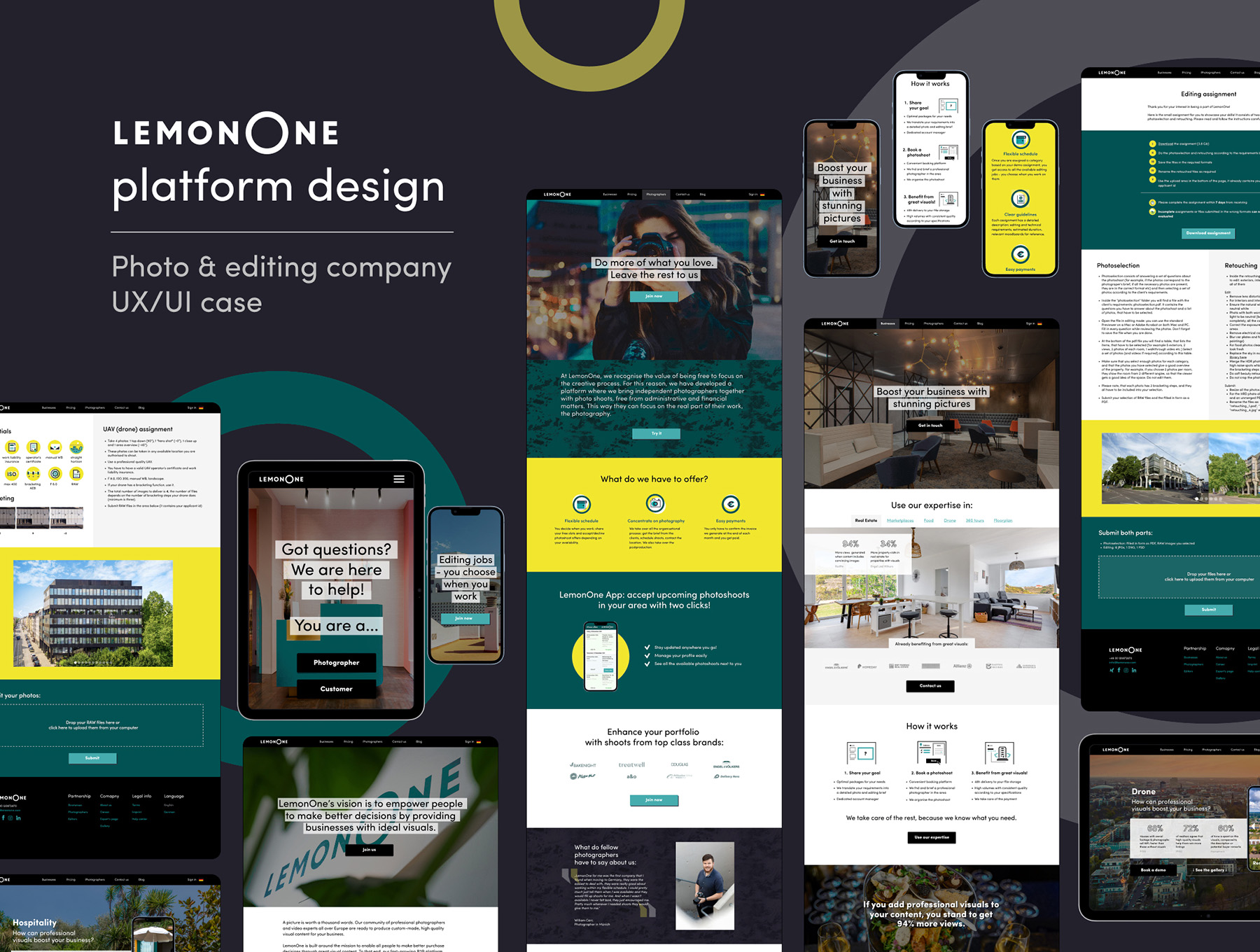
Photo & video editing platform (LemonOne)
This project was made as a part of my job at LemonOne (now BOOM!).
LemonOne is a developer of an on-demand photography platform intended to offer professional imagery for businesses (marketplaces, food & groceries, apartment rental etc)
It provides on-demand photos within hours through algorithms that match companies with a broad network of photographers, enabling clients to improve their visual content and boost online conversion rates, resulting in proper revenue and an increased order count.
The goal was to redesign the existing platform, splitting it into two visually distinct parts for its main two target groups: potential customers (B2B) and the creative community (photographers, videographers, retouchers).
Existing problems
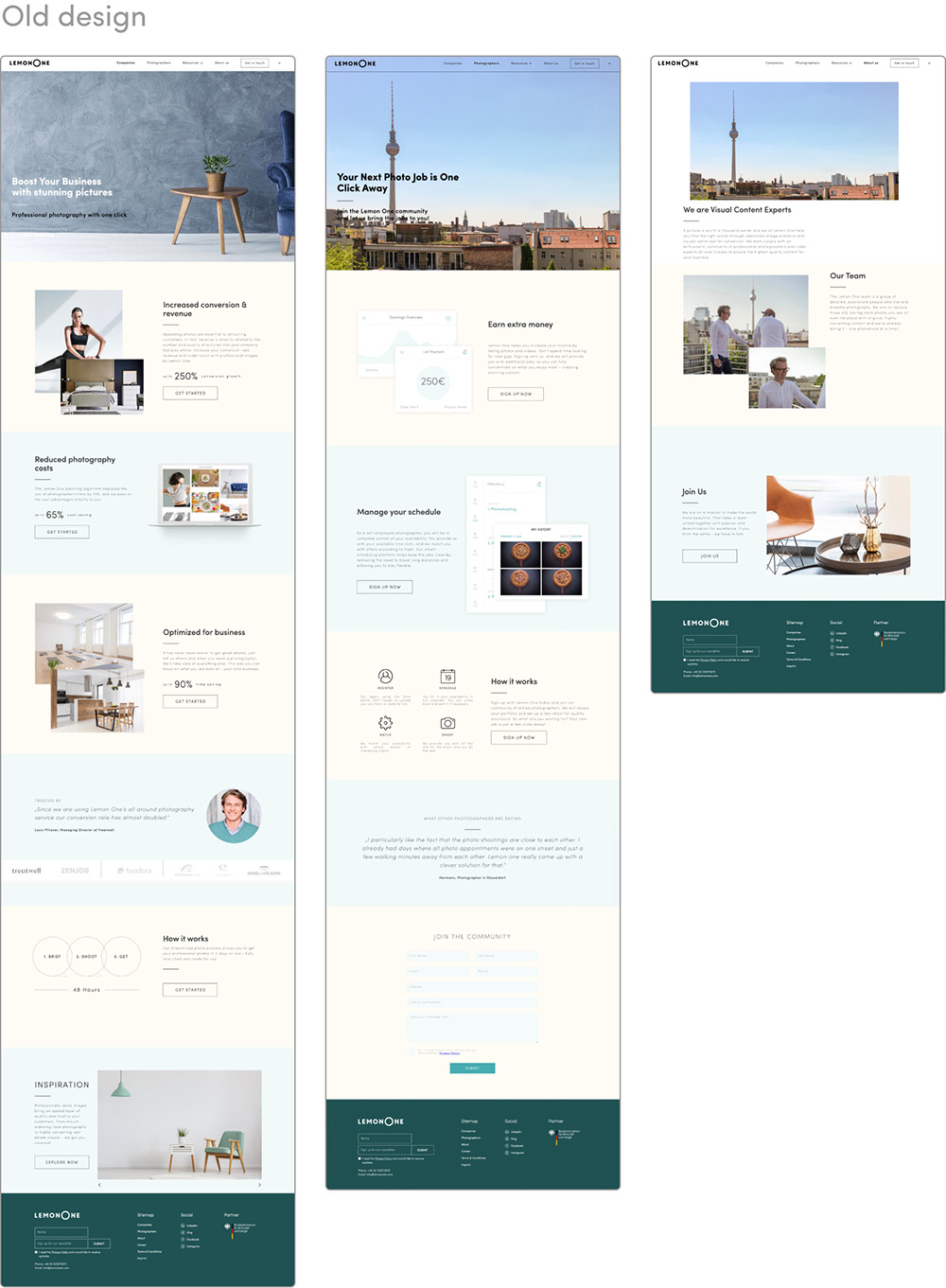
- Current website does not reflect the company’s focus, does not clearly present the industries they work with, prices, packages they offer etc.
- Poor explanation of the process for potential customers.
- Website not appealing to the creative community the company is seeking to attract.
Design-related:
- No clear CI guidelines, the two-page document only includes a logo and 4 corporate colours.
- Website has little to no visual correlation with the company’s corporate colours.
- Use of stock or poor images to represent a company, specialising in custom client-oriented photography.
- Poor visibility of important CTAs and some of the key slogans.
- Visually inconsistent elements such as website menu or signup forms.
- Unclear language switching functionality.
- Visuals in the photographer page do not represent actual workflow within the platform and are therefore misleading.
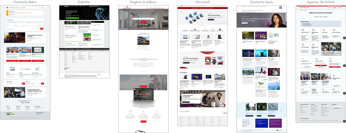
Target audience I: B2B
- Real estate
- Hospitality
- Food (Restaurant + Delivery) & Groceries
- Online marketplaces (Beauty salons, Sport venues etc)
Key points, determined from the research:
- Discreet colour scheme (even when using brand colours)
- Modest use of high-quality images
- Support the credibility and advantages of the company’s offers by credited evidence (quotes with visible names & sources)
- Clear explanation of the offers & product, step-by-step process description
- Important to underline the tech side of the company
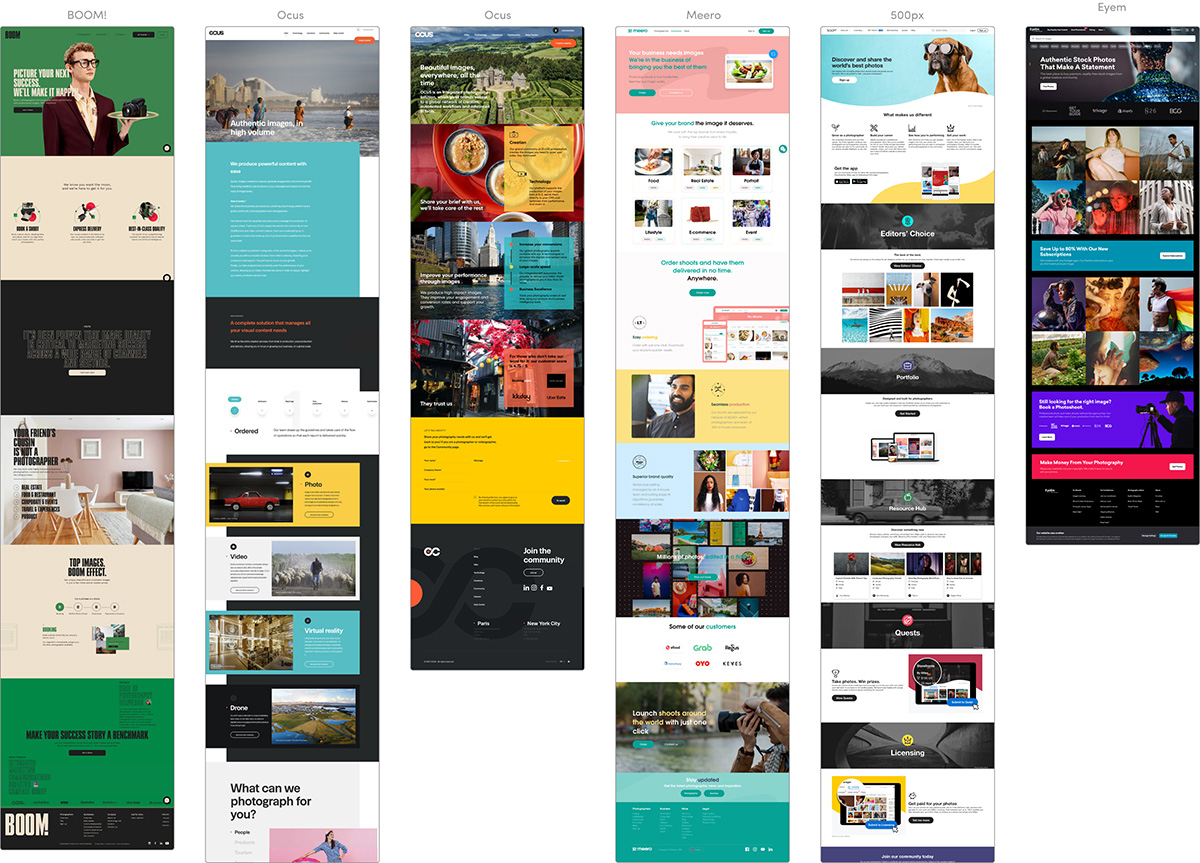
Target audience II: Creative community (+ competitor analysys)
Key points, determined from the research:
- Strong visuals, appealing to the audience – use of full-scale non-standard images, mainly photography.
- Memorable non-standard icons, bold catchy titles.
- Food (Restaurant + Delivery) & Groceries
- Big planes of pure colour, shaping the structure of the website & separating the segments.
- Various nested subcategories, devoted to a specific vertical, stressing out the impact of the creative community.
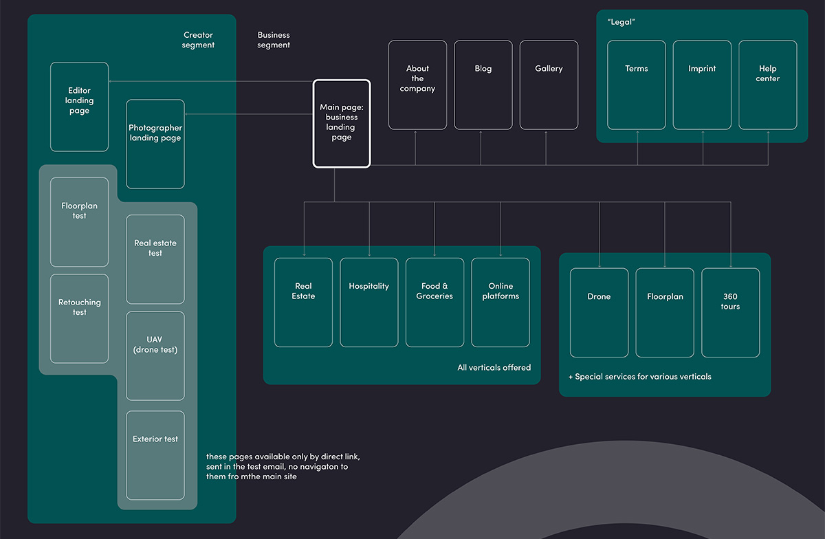
New website structure
Mockup development
1. Main page (business landing page)
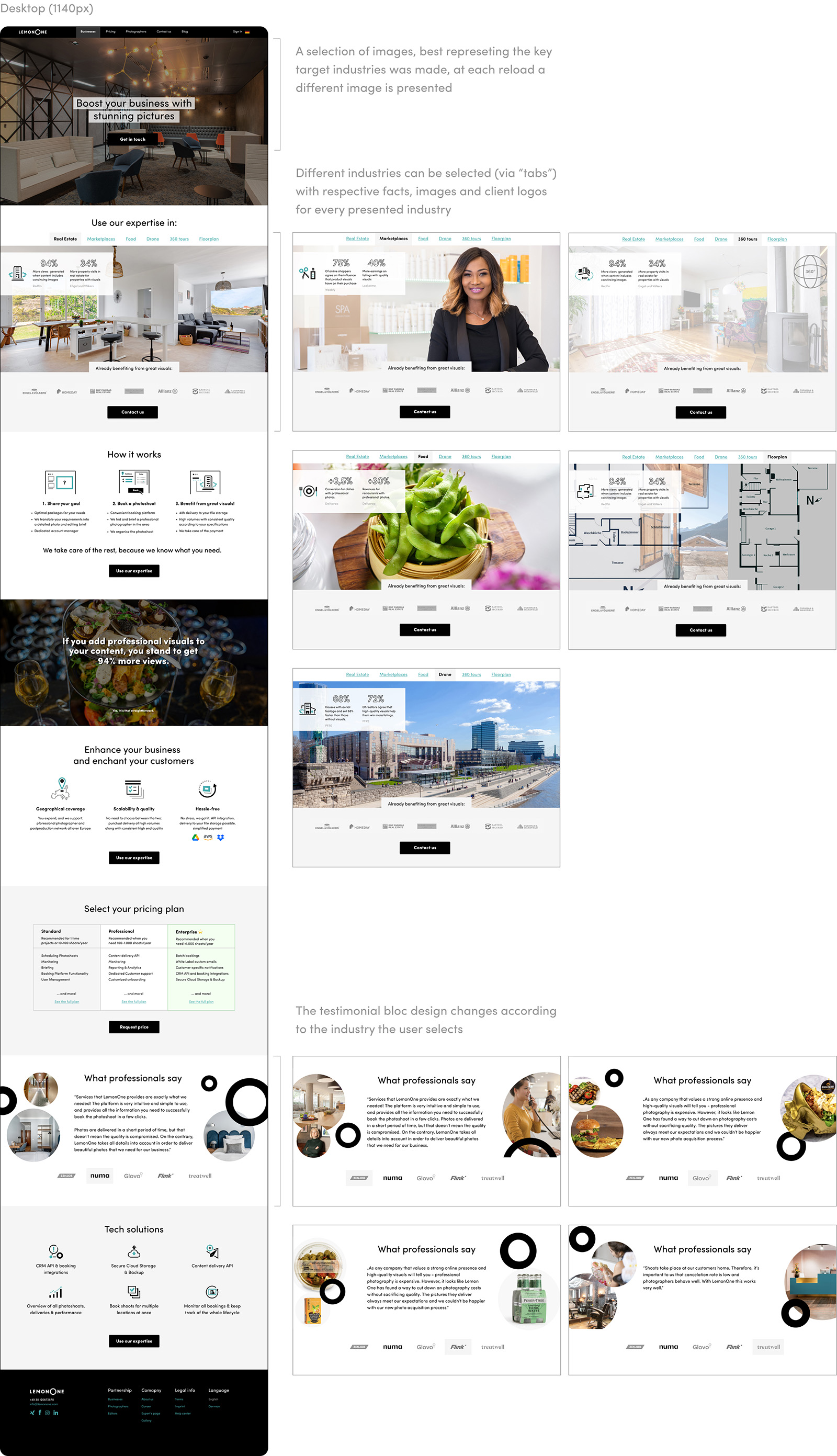
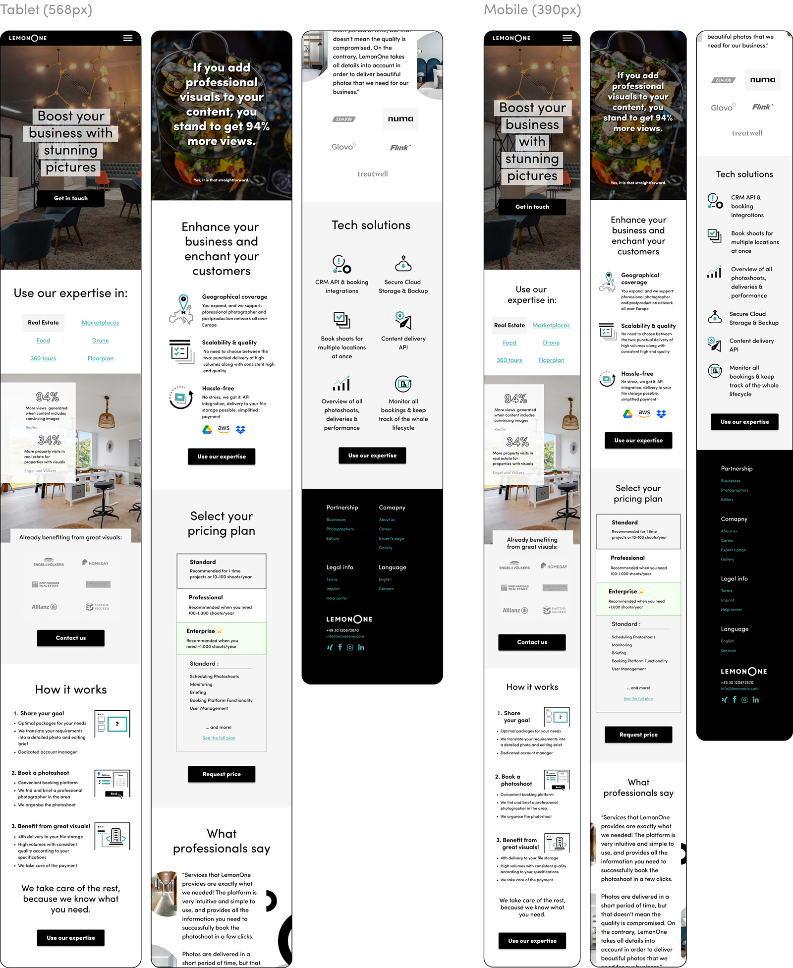
This is the main landing page, that is supposed to generate B2B leads and present the company for the customers, who have already had the initial call with the business department. Important segments, oriented at B2B customers were defined and then reiterated after the few reiterations and discussions with the customer’s business department.
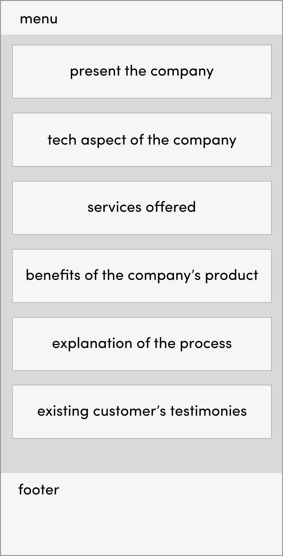
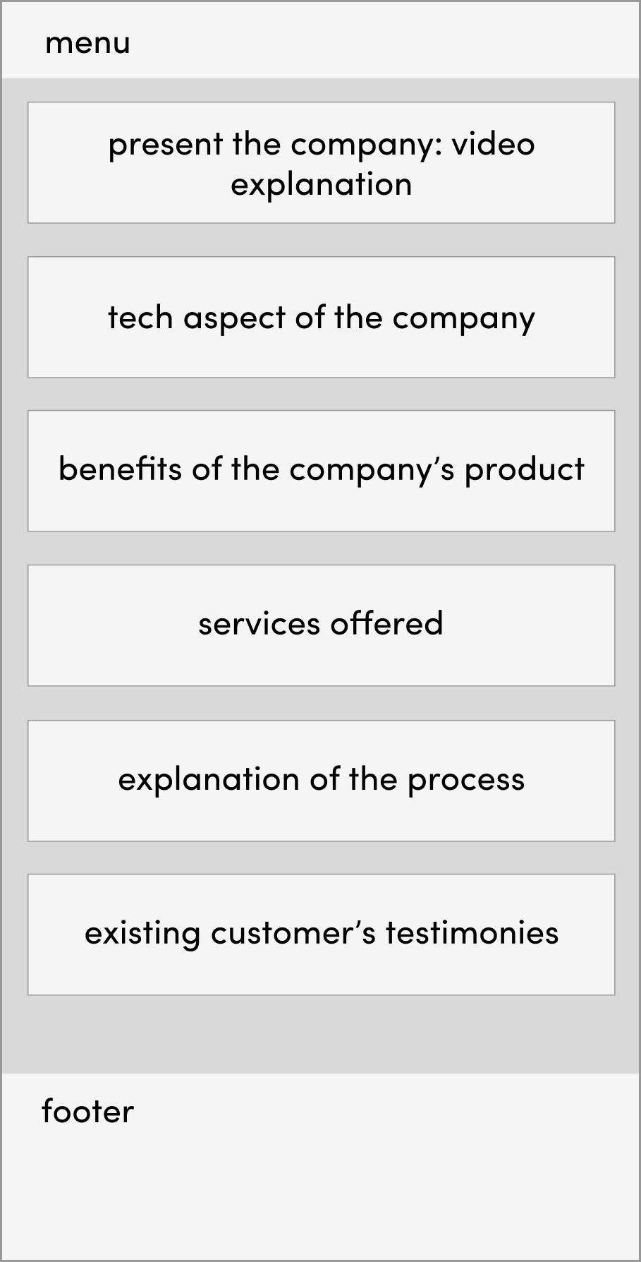
V1: the original concept was to start with the detailed presentation of the company, including outlining the tech spect, important for the founders, followed with the services they offer and ending with the description of how it all works, supported by customer testimonies in the end.
V2: after further research the decision was made to show the benefits of the product after presenting it, in order to persuade the customer, that this product fits for their business goals, followed by the list of services and then explanation of the process.
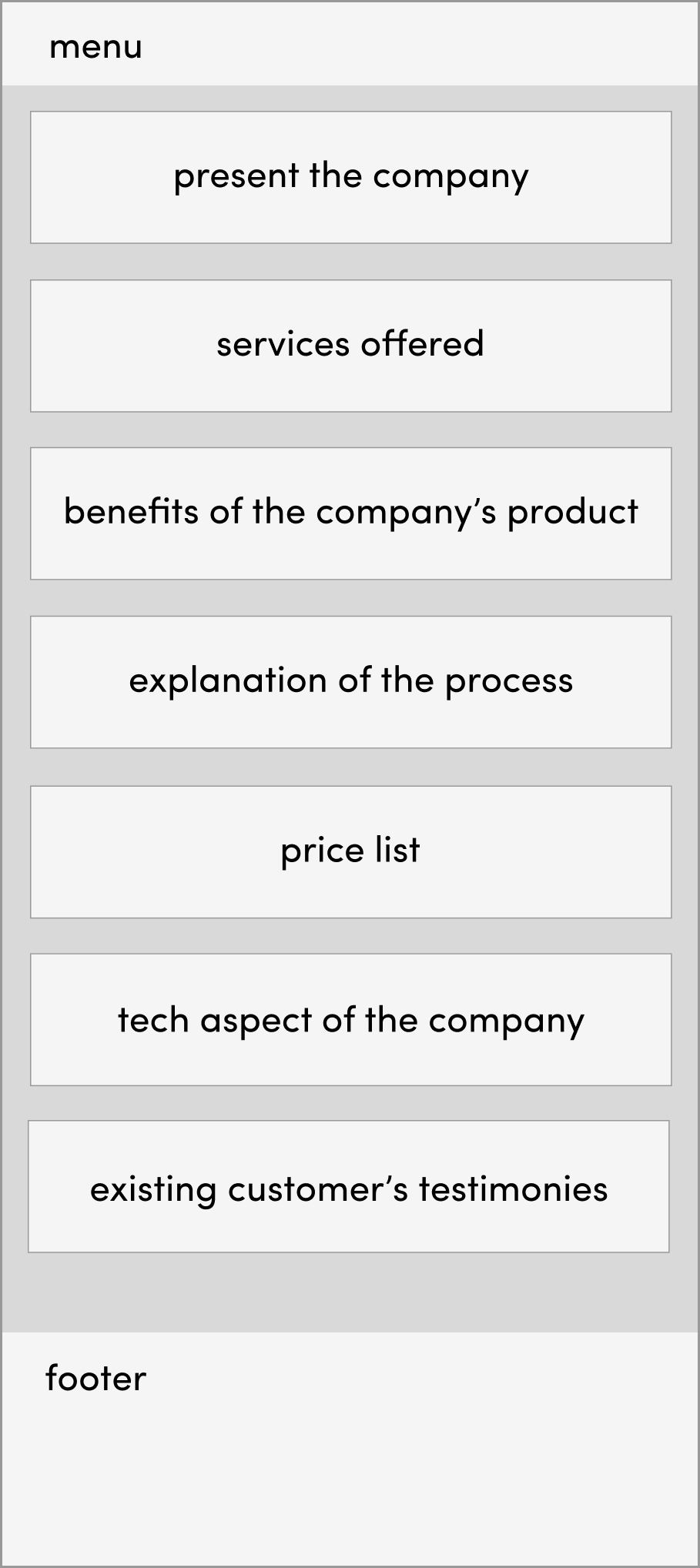
V3: at this stage it was decided, that the explanation video was too long and overwhelming for the header of the main page. Apart from that the list of services should go higher up, as before seeing the benefits the customer needs to know if the product is relevant for their business at all. Also, a price list was added.
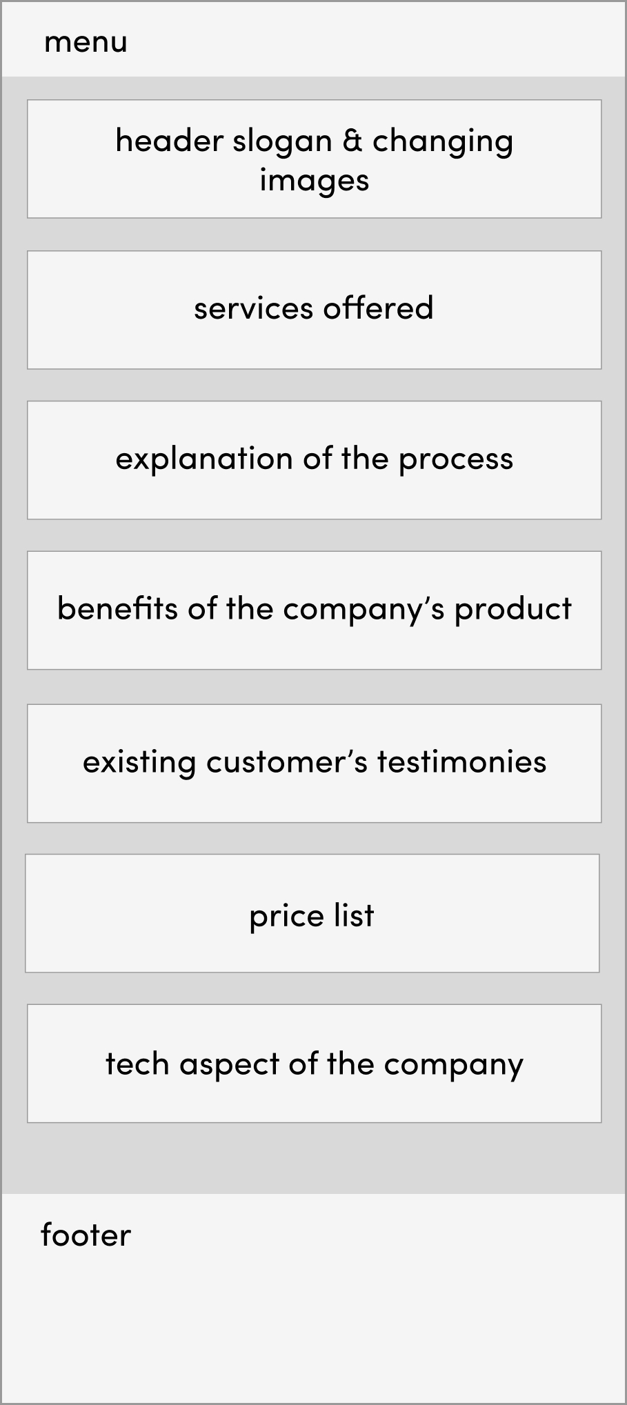
V4: in the end it was deemed, that the most logical was would be to show a gallery of images with the sloan at first, then inform the user about the services, followed by the explanation of how the work, their benefits + testimonies and show the price list in the end, followed by the tech features offered.
2. Photographer landing page
This is the landing page, where all the photographer leads were directed from the ad campaigns (unlike the retoucher page, as the retouchers were mostly hired by the responsible team via reaching out one by one).
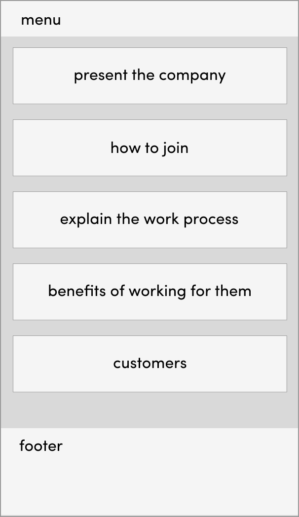
V1: in the first version the page started with presenting the company, followed by the explanation of how to apply, work process breakdown, benefits of being a partner photographer and the brands one will be working with.
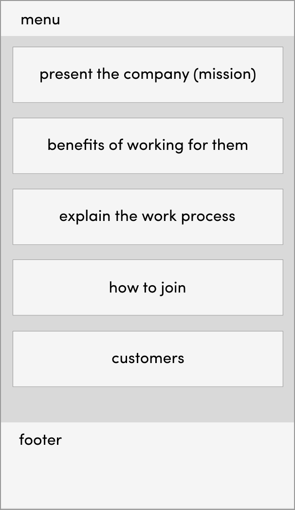
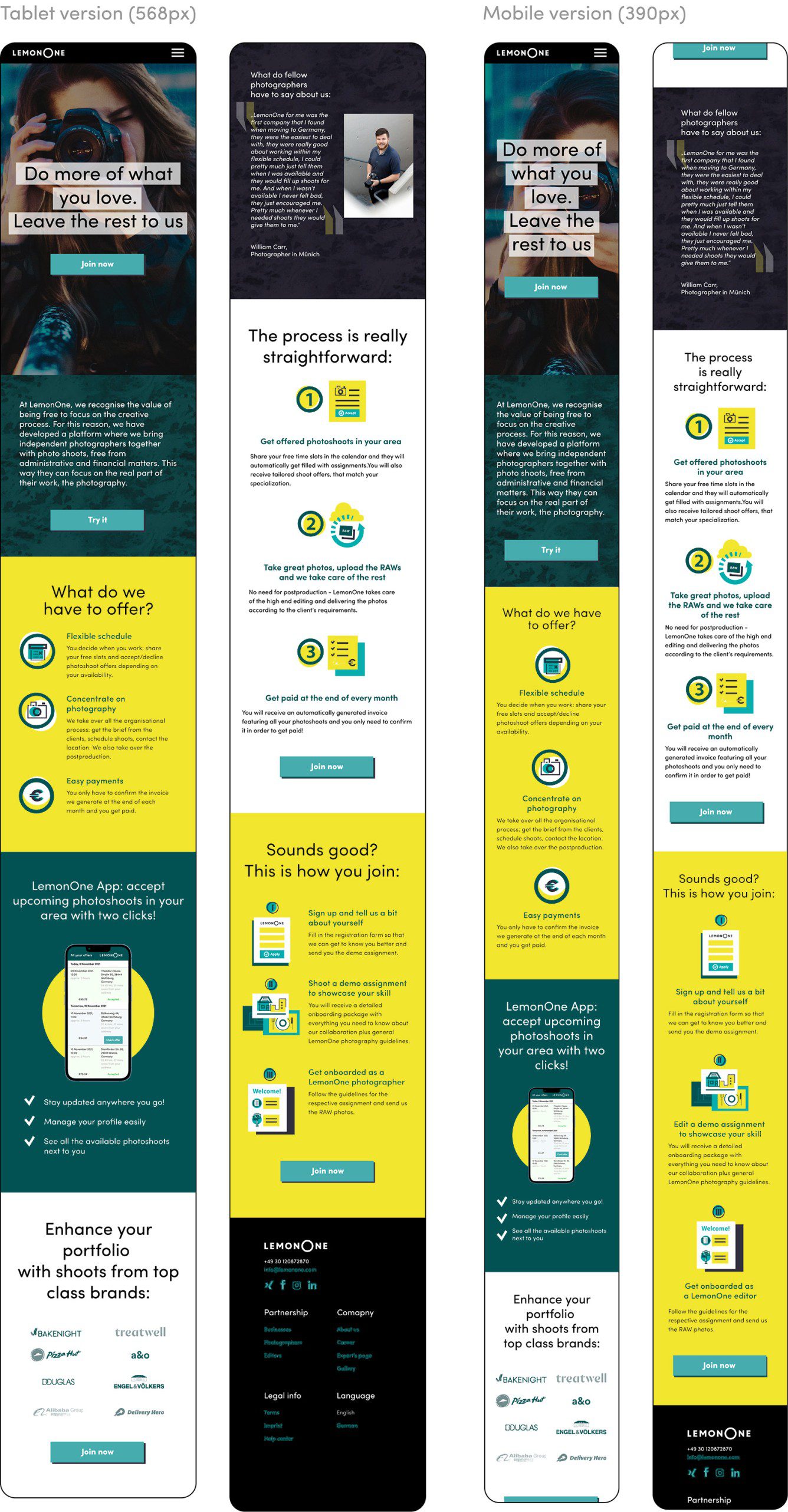
V2: after receiving the feedback it was established, that before inviting photographers to join one should explain them why they would be interested in working for the company and explain the process first.
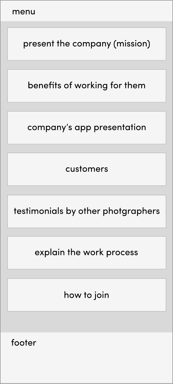
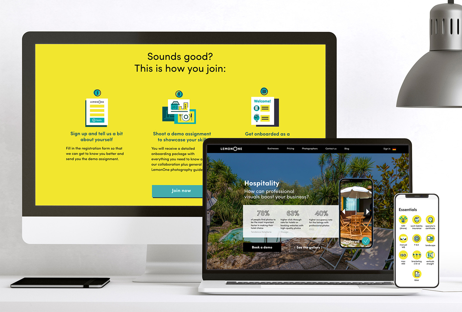
V3: this version was extended with the presentation of the company’s app, as it is a big advantage in terms of convenience for photographers, that makes the company stand out among similar job offers.
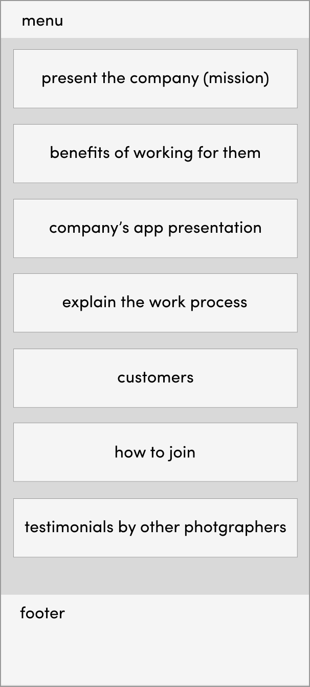
V4: for the final layout it was defined, that the most logical flow for a potential partner photographer would be to read the mission and see the benefits of collaboration: convenience, big names for the portfolio, other photographer testimonials, followed by the explanation of the work process and how to apply in the end.
Visual assets
1. General CI
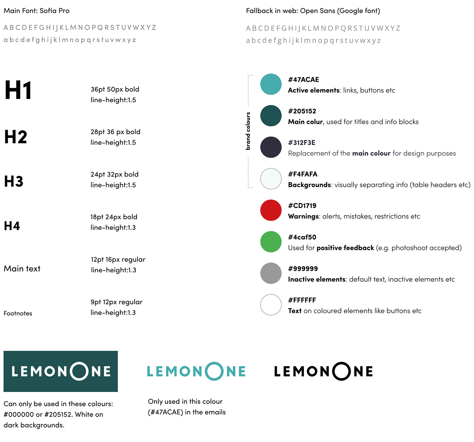
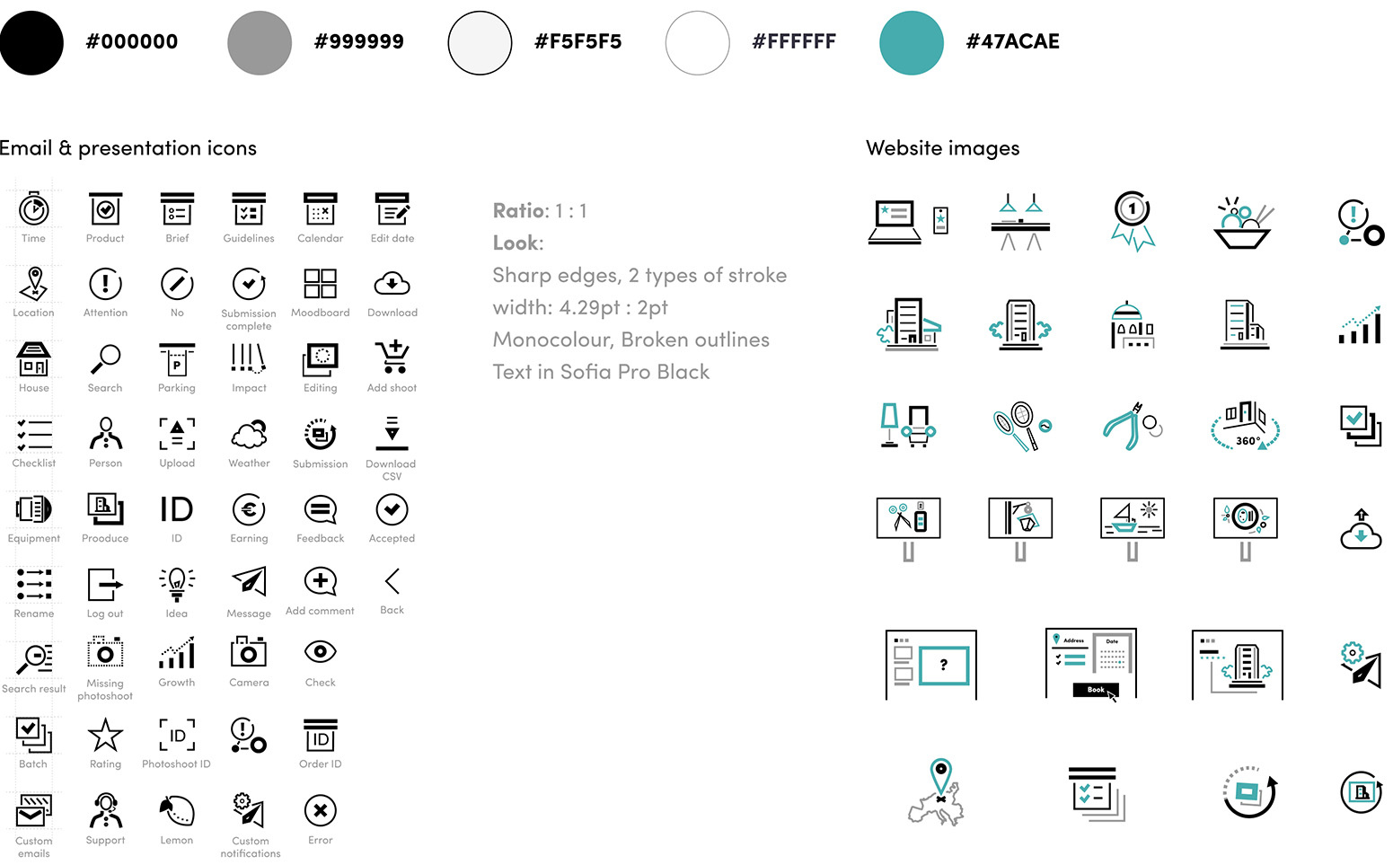
2. Assets for the B2B facing segment
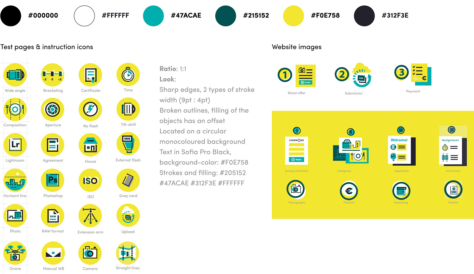
3. Assets for the creative community segment
Business segment pages
1. Main page (landing)
2. Vertical-specific landing pages
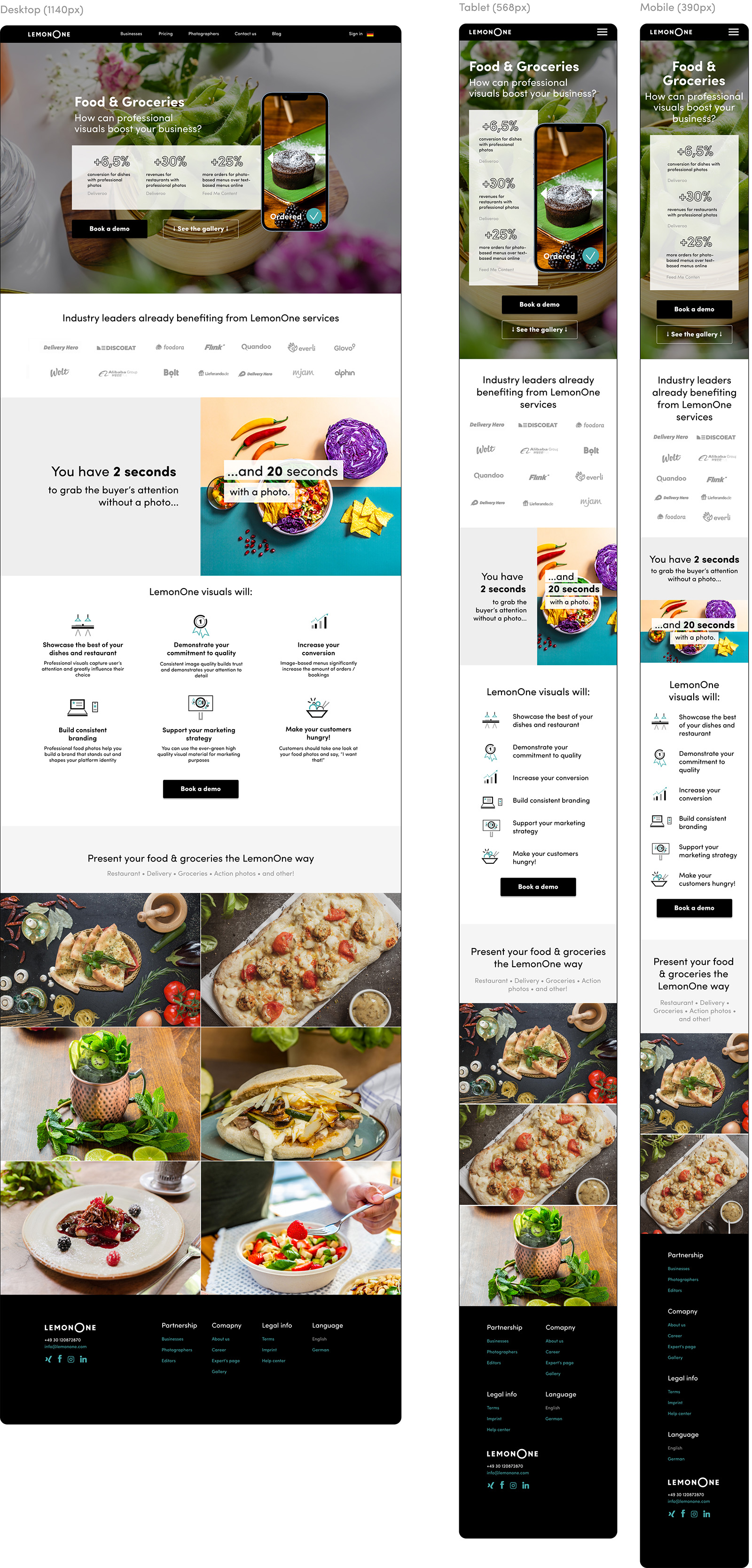
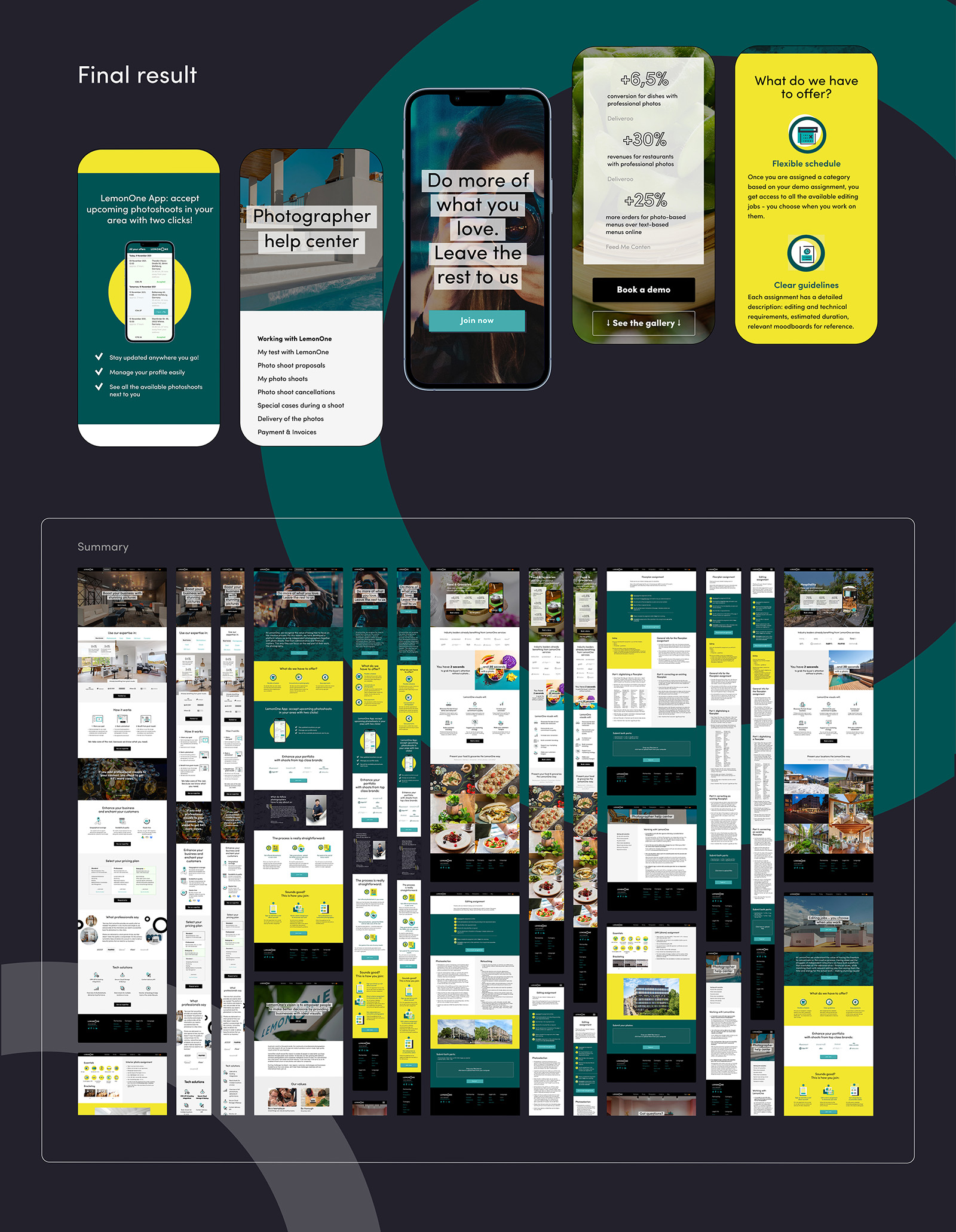
After the “food” page structure was approved, it was used as a template for presenting the other industries.
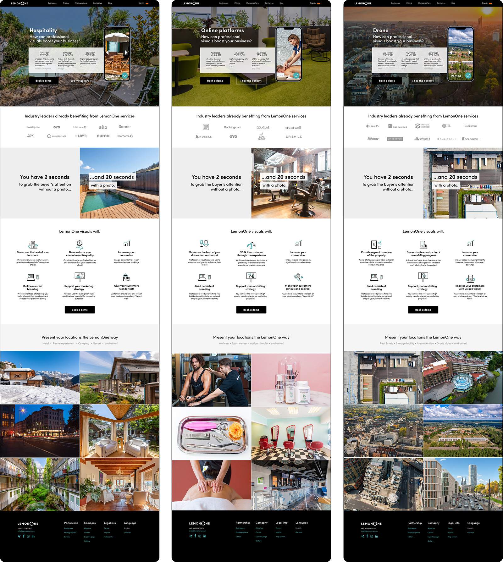
Research was conducted to select relevant facts, supporting the necessity of high quality images for each vertical: included in each page with a reference, in the same manner as on the main website page. The “benefits” block was customised with relevant icons and statements, a gallery of selected examples, best reflecting what the customer is offered was set up.
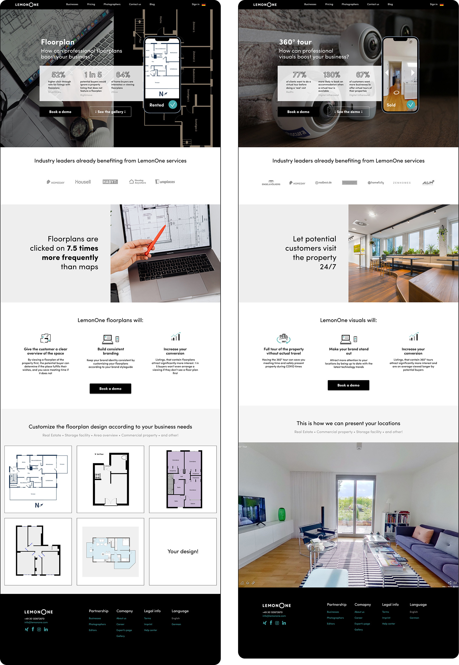
Apart from the four main verticals there are also three specific services such as drone photo- and video shoots, creating a floorplan and a virtual 360° tour of the property (last two mainly used in real estate).
While for the four verticals a gallery of the best company’s photoshoots was embedded at the bottom of the page, a video was included for the drone page, giving an example of an image video of a high-end location.
The special feature of offering floorplans, created via the Magicplan app is the the opportunity for the customer to make a wide range of customisation – both technically and visually. It is reflected in the different examples, replacing the gallery at the bottom of the page.
For the 360° tour a demo was also embedded into the page to immediately give the customer an idea of what they might expect.
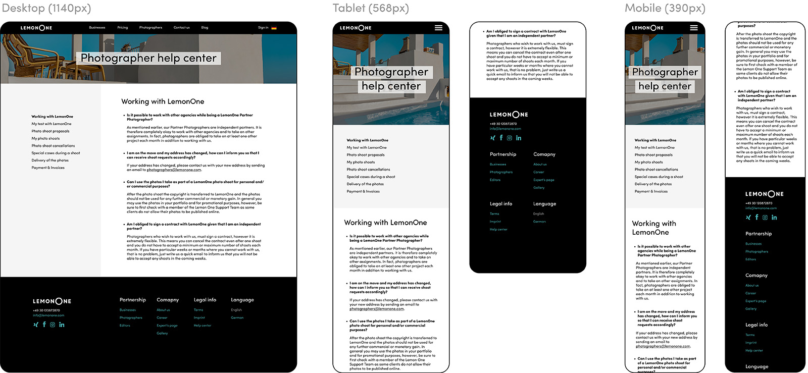
3. Help center
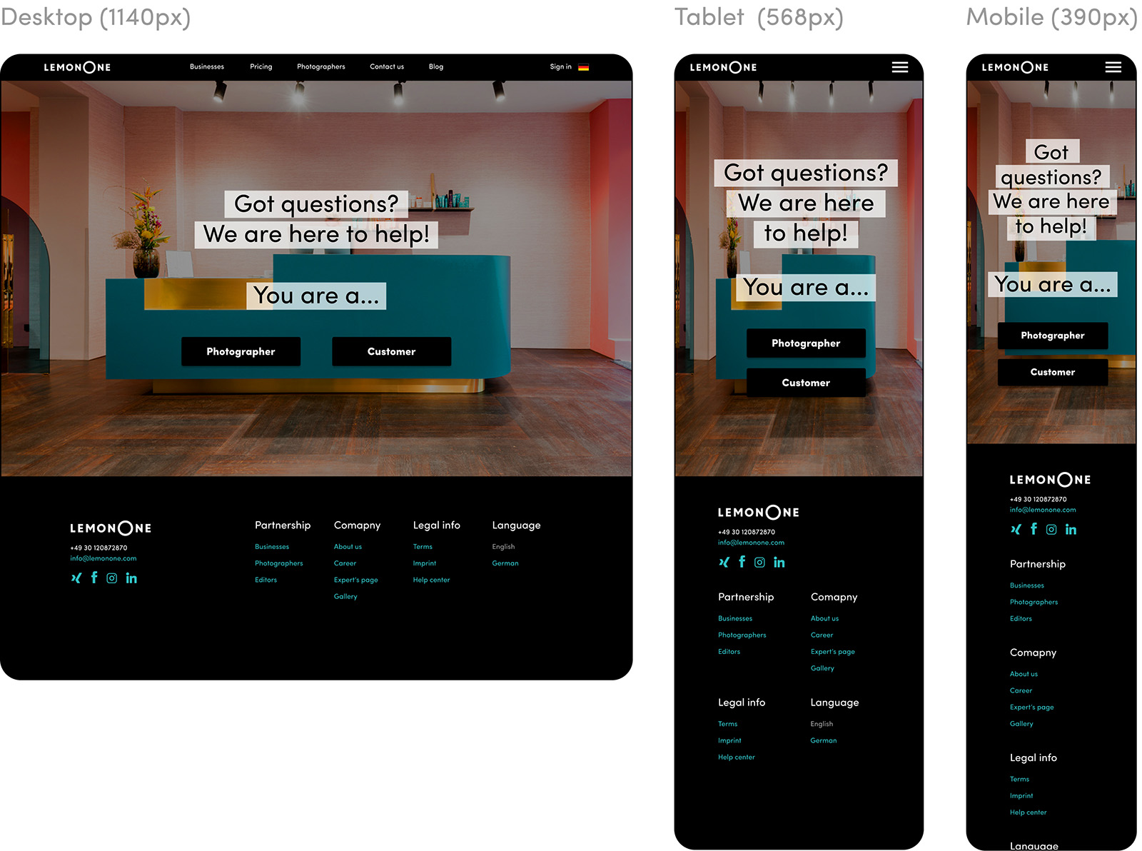
Other “internal” pages follow the same style, having a full-screen header with a background image and a name of the section on top.
The help center is split into the two main categories – the customer and the photographer space (retouchers have a separate portal for their work, where they have a help center along with detailed instructions of the workflow, invoicing etc.).
Customer and photographer help centers both consist of multiple categories with subcategories, having long detailed explanations on the topics. To optimise the navigation, the list of sections is given on the left, so that each can be easily accessed and unfolded in the page.
4. About the company
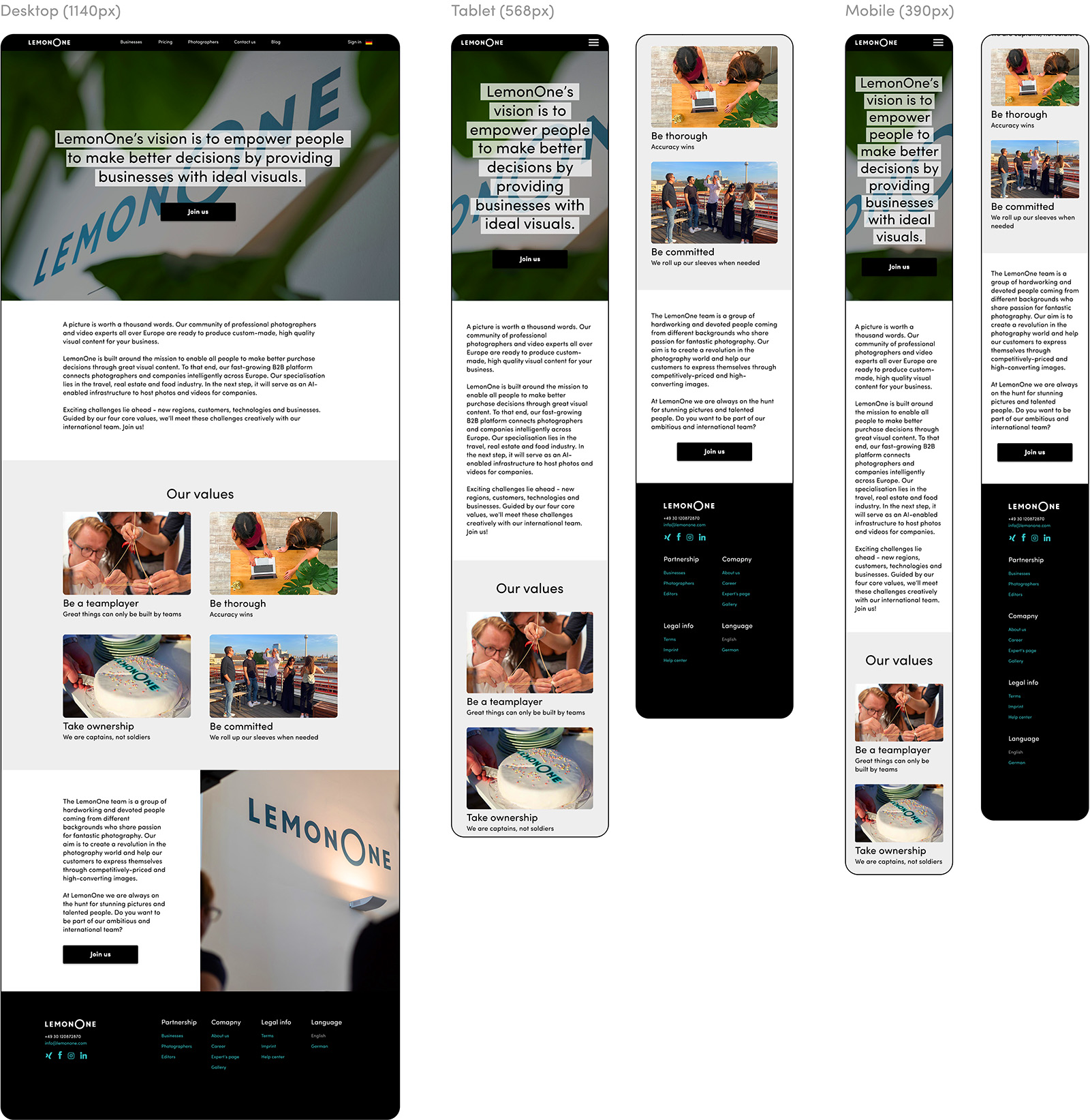
This segment is oriented at potential employees, so there are several main aspects to keep in mind when designing the page. The first bloc is presenting the company and it’s mission, outlining both current business, as well as the prospects for the future development (in this case building a AI-enabled infrastructure).
Next bloc has photos from the in-office events, paired with the official company’s values.
On “join us” the user is redirected to a recruitment website, where all the open roles are listed and a quick application option is available.
Creator segment pages
1. Photographer landing page (main page of the creative bloc)

Other “internal” pages follow the same style, having a full-screen header with a background image and a name of the section on top. The help center is split into the two main categories – the customer and the photographer space (retouchers have a separate portal for their work, where they have a help center along with detailed instructions of the workflow, invoicing etc.).
Customer and photographer help centers both consist of multiple categories with subcategories, having long detailed explanations on the topics. To optimise the navigation, the list of sections is given on the left, so that each can be easily accessed and unfolded in the page.
2. Editor landing page
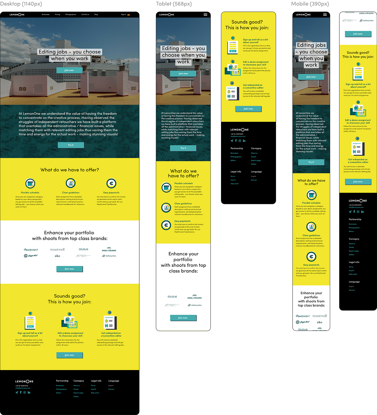
Although editors are usually contacted individually, the idea was still to have a page that would help the visual content team gather leads. Therefore it also has the explanation of the work process for the retouchers, as well as an instruction on how to apply.
The visuals were adapted to reflect the specifics of the retoucher application, and a Typeform for applicants is also embedded. An automation is setup to send them an email inviting to do a test once the application is received.
3. Creative community tests: photographers
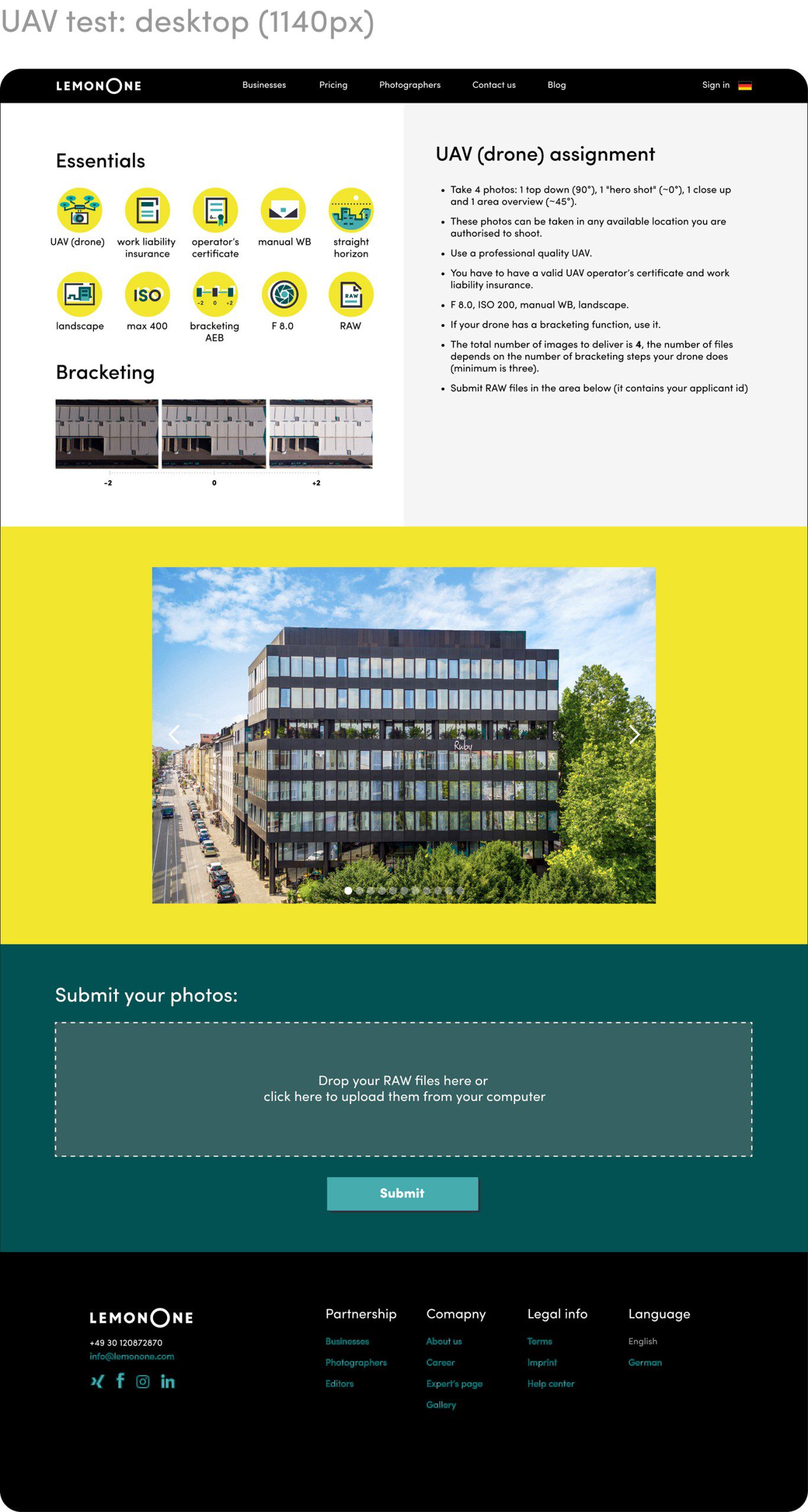
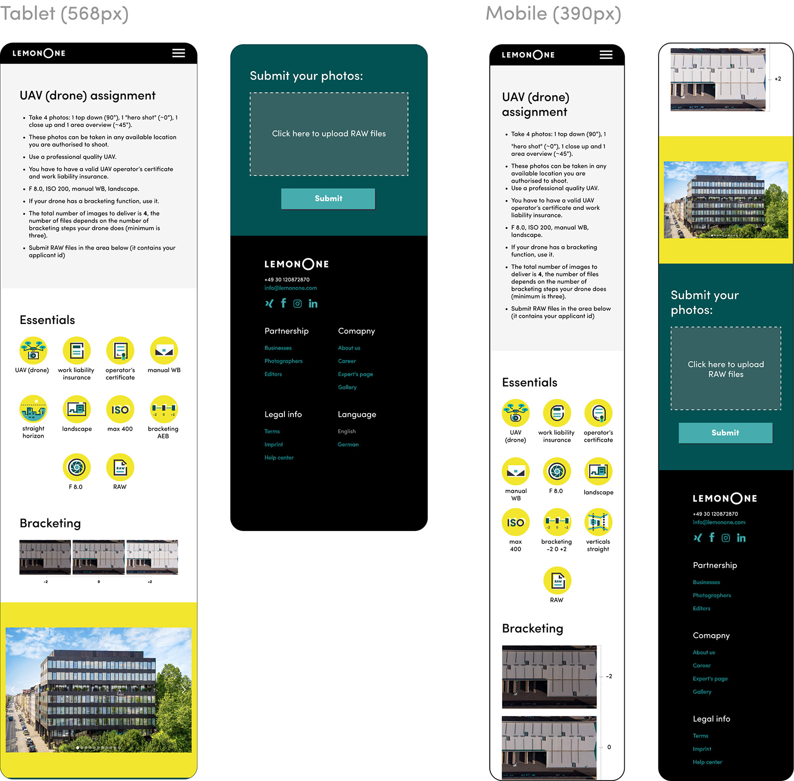
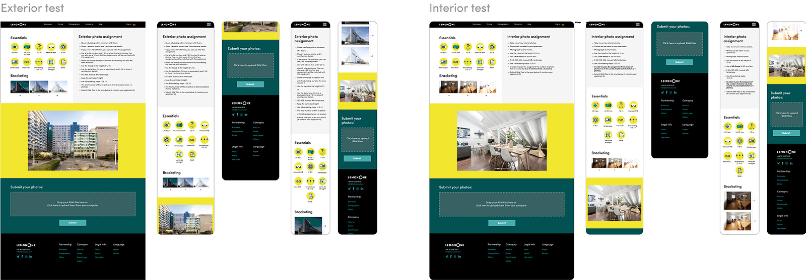
When the photographer receives their application confirmation, they are invited to do a test task. The page has a customised upload field, that already contains the applicant’s ID, so they can submit the works directly in the page. Before the submission field examples of expected photos ar given.
4. Creative community tests: retouching & floorplan
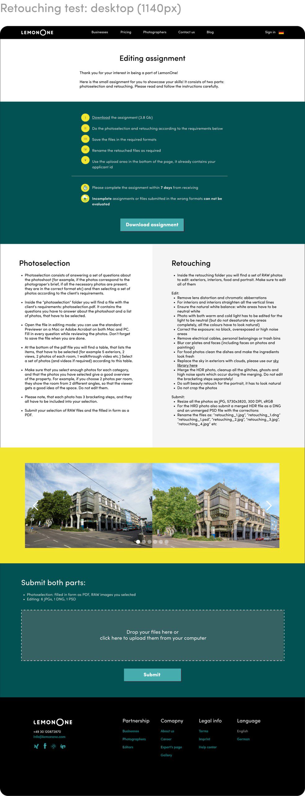
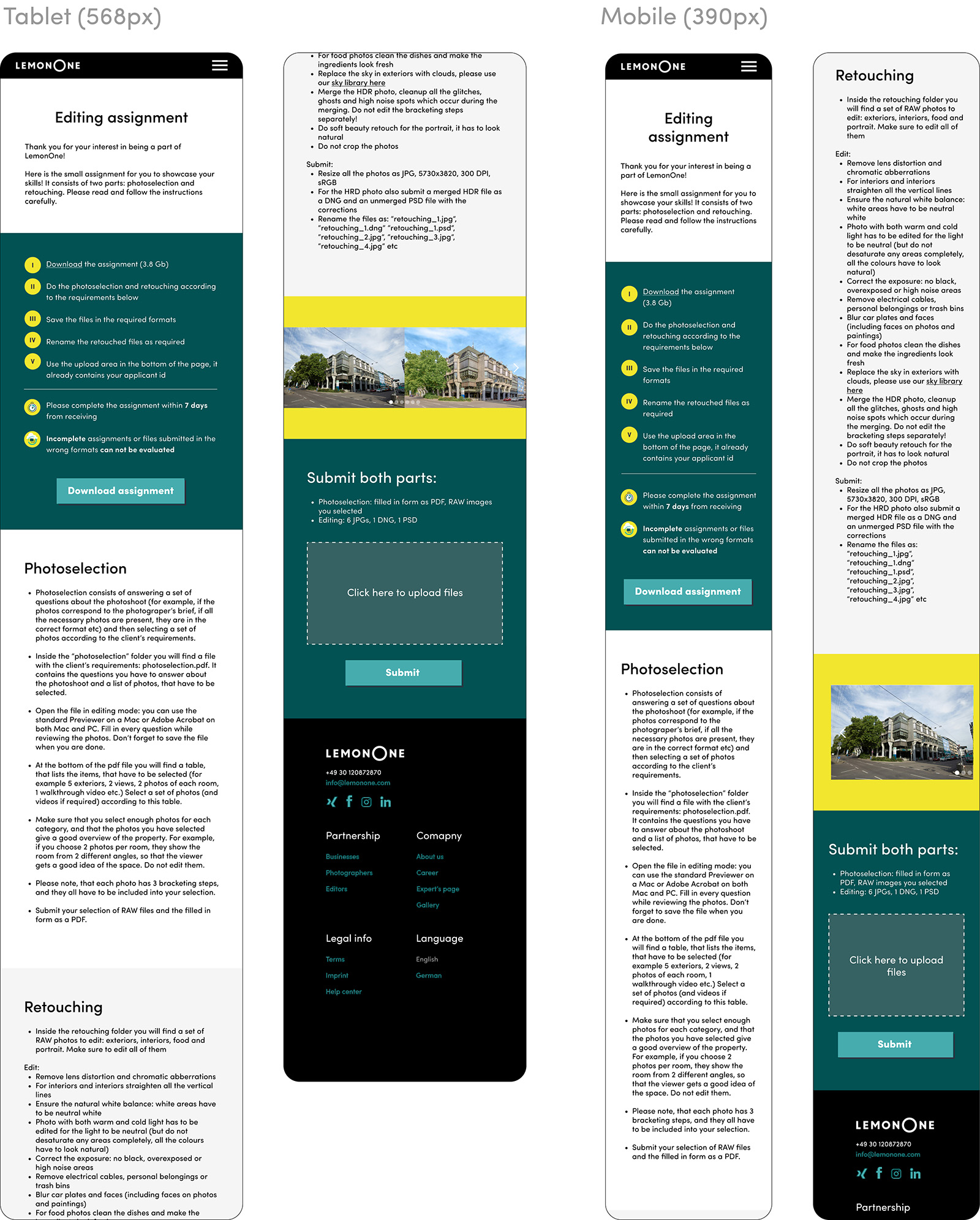
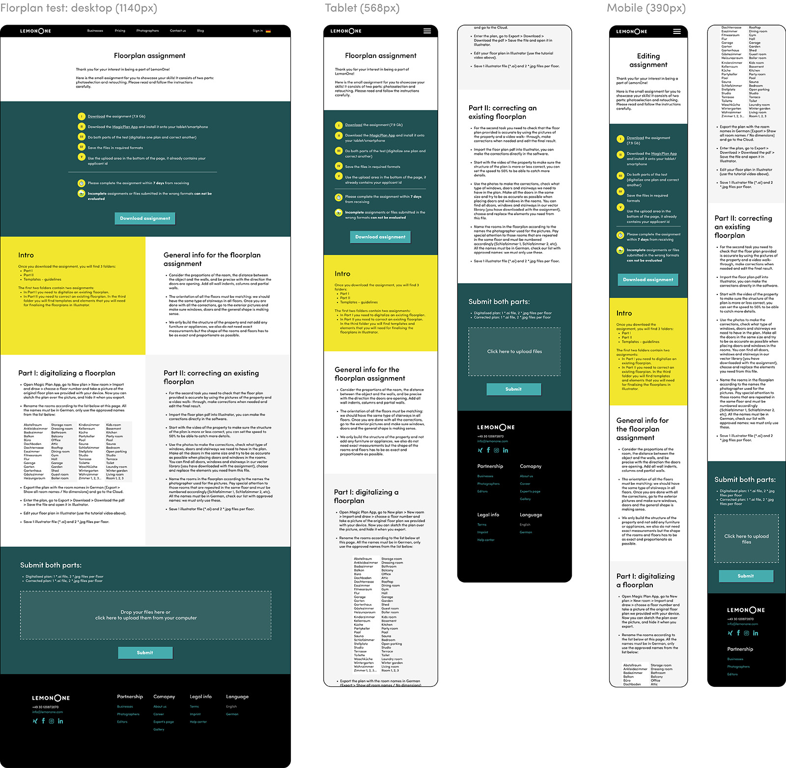
The retouching test consists of two parts: photoselection & editing. They are visually separated into different blocks to make the information easier to navigate. The common instruction for the completion of both parts is split into 5 steps in the beginning of the page, followed by a link to the source files.
Same as with the photo tests, the user gets access to the page via a link in the email, so the field at the bottom of the page already contains their applicant ID. In any other case the submission field is not displayed to the user.
Final result
